Definition of Curve Fitting
Curve fitting is the process of applying a mathematical expression (a curve) to raw data to represent its underlying trend, making the data usable for analysis and computation.
MATLAB · YouTube · 8:49
This introductory segment defines curve fitting as a method to process raw data by applying a mathematical trend, making it usable for engineering analysis. It highlights techniques like pre-processing to handle noise and outliers. The video outlines its agenda, covering interactive fitting, non-linear regression, optimization, and Simulink integration. Finally, it uses wind turbine data as an example, explaining the physical generation mechanism and the resulting sigmoidal relationship between wind speed and power output. This 150-second segment introduces curve fitting through a wind-turbine example in MATLAB. It begins with the idea that turbine output saturates at higher wind speeds, then moves to a tabular dataset containing several environmental factors. The presenter removes anomalous records, uses the Curve Fitter app to plot wind speed against power output, and selects a sigmoidal model because the scatter plot has an S-shaped trend. After obtaining a good initial fit, the video broadens the discussion to multiple factors—wind direction, air density, turbulence, and wind shear—and shows a nonlinear model that keeps the sigmoid dependence on wind speed while assuming linear effects for the others. The segment ends with a Plot Slice comparison indicating that wind speed has the largest impact in this fitted example. This video segment demonstrates advanced curve fitting techniques in MATLAB for modeling wind turbine power output. It begins by using p-values to identify and remove statistically insignificant predictors like wind shear. The tutorial then transitions to formulating the curve fit as a constrained optimization problem using the Optimization Toolbox, allowing users to enforce physical bounds on model coefficients. Finally, it compares the results of this optimization approach against a standard fit using metrics like R-squared and RMSE, concluding they are highly similar, and briefly touches on integrating these models into Simulink simulations. This 79-second excerpt concludes a MATLAB curve-fitting tutorial by showing how a previously fitted wind-speed/power-output model is turned into a Simulink lookup table. It begins in a Simulink subsystem with two 1-D lookup tables fed by windSpeed: the upper one for the MPPT omega relationship and the lower one for power output. The view then switches to Curve Fitter, where a sigmoidal logistic fit is shown for powerOutput versus windSpeed, along with fitted coefficients and statistics such as R-square 0.98867 and RMSE 3.4684. The presenter exports this fit as a Simulink lookup table, replaces the lower manual lookup with a new block named curveblock, and states that the subsystem is now calibrated from the latest experimental data. The clip closes with a recap slide summarizing the workflow: fitting curves to data, non-linear regression, optimization with constraints, and integration into Simulink.
Use the learning inspector for key ideas and moments, or open the reading tabs for the complete notes.
Generated from the video's visuals and explanation; not verbatim speech.
The video opens by highlighting the ubiquity of data generated by modern technology. It poses the central problem: transforming jumbled, unconnected data points into a cohesive, reusable model. This sets the stage for introducing curve fitting as the solution.
The speaker explains that raw data is often unhelpful for engineers attempting to make computations or draw conclusions. To make data truly usable, it must be processed. Curve fitting is defined as this processing step, where a mathematical expression is fitted to the data to represent its underlying trend.
To ensure the fitted curve is robust against outliers and noise, techniques such as pre-processing and data cleaning are mentioned. These steps help refine the model, making it more reliable for analysis.
Curve fitting is presented as a tool for uncovering the 'story' within the data. By filtering out individual noise and focusing on overall trends, engineers can better understand the effects of various factors and parameters, which is crucial for interpreting large datasets.
The agenda for the rest of the video is outlined. It will cover interactive curve fitting in MATLAB, extending the model to non-linear regression for statistical analysis, optimizing the model by constraining coefficient bounds, and finally integrating the curve fit into a Simulink model.
A practical example is introduced using wind turbine data. The physical mechanism is described: wind causes the turbine blades to rotate, which turns a generator to produce electricity. This chain of events leads to a specific mathematical relationship.
The relationship between wind speed and power output is identified as sigmoidal. This is because a minimum wind speed is required to start the rotation and generate power, resulting in an S-shaped curve when plotted. An animation visually reinforces this concept.
The clip opens with a simple physical motivation: as wind speed rises far enough, the turbine generator reaches its maximum electrical output. This sets up the expectation that the input-output relation will not be a straight line forever, but will bend and saturate.
The presenter then frames the central modeling question: given raw observations of wind speed and power output, including outliers, how can we recover a smooth functional description? The answer given is curve fitting, which becomes the organizing theme of the segment.
A tabular dataset is introduced. The visible columns include multiple wind-related variables and a power column, establishing that power output is the response and several environmental factors are candidate predictors. For the first demonstration, wind speed is isolated as the main explanatory variable.
Before fitting, the workflow applies preprocessing. The narration states that anomalous events have already been identified from performance logs and are removed. This makes clear that the modeling pipeline begins with data cleaning, not with immediate estimation.
The MATLAB Curve Fitter app is opened. The user selects wind speed as the x-variable and power output as the y-variable, producing a scatter plot. The interface then allows both visualization and model estimation in one place, which is the practical point of this demonstration.
Looking at the scatter plot, the presenter chooses a sigmoidal fit because the data rise slowly at first, steepen in the middle range, and flatten again at higher wind speeds. The fitted S-shaped curve is overlaid on the points, and goodness-of-fit statistics appear in the side panel.
The narration notes that the fit could be improved further by excluding particular outlier points or changing advanced options, but treats the current result as sufficiently accurate for the example. This distinguishes an initial successful fit from later optional refinement.
The discussion then widens from one predictor to several. A slide lists wind direction, air density, turbulence, and wind shear in addition to wind speed, signaling that the next model will attempt to capture joint effects rather than a single bivariate relation.
A nonlinear model is written on screen. Its structure keeps the sigmoid dependence on wind speed, represented by parameters b1, b2, and b3, while adding linear terms for the remaining factors through b4 to b7. The code also shows a MATLAB nonlinear fitting call, making the transition from exploratory curve fitting to formal regression explicit.
Finally, the Plot Slice window displays one panel per predictor. The wind-speed panel is steep and clearly S-shaped, whereas the other panels are nearly flat. The presenter interprets this as evidence that, in this fitted example, wind speed dominates the predicted power output and the other factors contribute much less.
When analyzing a fitted curve, it is crucial to check the statistical significance of each predictor variable. In the displayed table, the 'Wind Shear' predictor has a nearly horizontal curve and a p-value of 0.32. Since 0.32 is well above the standard significance threshold of 0.05, we conclude that wind shear does not significantly impact the power output in this model and can be safely removed to simplify the equation.
After establishing a baseline model with significant factors, the next step is to refine it by incorporating physical realities. A purely mathematical fit might predict impossible values, such as negative power or infinite output. To prevent this, we introduce bounds and constraints, ensuring the model accurately reflects the operational limits of the wind turbine.
MATLAB's Optimization Toolbox allows us to treat curve fitting as a formal optimization problem. Using the 'Optimize' live task, we define the model coefficients (x1 through x6) as optimization variables. We set their initial guesses based on our previous statistical fit and then assign specific lower and upper bounds to each coefficient, restricting the solver to physically meaningful regions.
The core of this optimization is the objective function, which we define as the sum of squared errors between the actual turbine data and our model's predictions. By selecting the 'lsqnonlin' solver, MATLAB will iteratively adjust the bounded coefficients to minimize this error, effectively performing a constrained curve fit.
Once the optimization completes, we have two models: the original statistical fit and the new constrained optimization fit. We compare them using standard metrics shown in the summary table: R-squared, Adjusted R-squared, RMSE, and SSE. The values are nearly identical (e.g., R-squared is 0.98962 for both), proving that adding physical constraints did not degrade the model's accuracy while making it more robust.
With a validated and constrained mathematical model in hand, we can move beyond simple visualization. These models serve as reliable predictors for future data. Furthermore, they can be integrated into complex system simulations, such as the Simulink wind turbine model shown, where the fitted equations calibrate specific subsystems like the Maximum Power Point Tracking (MPPT) controller.
The clip opens on a Simulink model whose single input is windSpeed. That input splits into two branches, each implemented as a 1-D lookup table. The upper branch is labeled mpptOmega and leads to wReference; the narrator identifies it as the MPPT omega relationship. The lower branch is labeled mpptActivePowerDemand, passes through a gain block marked MW to W, and ends at activePowerDemand; the narration states that this second table represents the relation between wind speed and power output.
The view changes to the Curve Fitter app, where the earlier empirical model is displayed as a scatter plot of powerOutput against windSpeed with a blue fitted curve. The model type is Sigmoidal, and the equation shown is . The results panel lists fitted coefficients , , and , together with confidence bounds and goodness-of-fit measures including , , , adjusted , and .
To reuse this fitted relation inside the simulation, the presenter opens Export and chooses Create Simulink Lookup Table. A dialog titled Create Lookup Table Block appears briefly, indicating that breakpoints are specified there. The video then returns to Simulink, where the lower lookup has been replaced by a new block named curveblock whose icon shows an S-shaped curve. The narrator explains that this gives a subsystem and lookup tables calibrated from the latest experimental data.
A closing slide summarizes the whole tutorial as a four-stage pipeline: Fitting Curves to Data, Non-Linear Regression, Optimization with Constraints, and Integration into Simulink. On the right, scattered colored points are first shown as raw data and then connected by a smooth blue curve, visually condensing the move from observations to a fitted model and finally to a Simulink implementation.
The presenter then delivers closing remarks on camera and the video ends with a Thank you for watching card and MathWorks branding, directing viewers to related toolbox documentation rather than adding new mathematics.
Curve fitting is the process of applying a mathematical expression (a curve) to raw data to represent its underlying trend, making the data usable for analysis and computation.
Raw data is often unhelpful for engineers. Processing it through methods like curve fitting transforms it into a cohesive model, allowing for meaningful computations and conclusions.
To make a curve fit more robust against outliers and noise, techniques such as pre-processing and cleaning the data are applied before or during the fitting process.
Curve fitting helps reveal the overall story in data by cutting through individual noise points, enabling engineers to understand the effects of different factors and parameters.
The video covers interactive curve fitting, non-linear regression for statistical significance, optimization with constrained coefficients, and integration into Simulink models.
Wind turbines convert kinetic energy from wind into electrical energy. The wind rotates the blades, which turns a generator to produce power.
The relationship between wind speed and power output in wind turbines is modeled as a sigmoidal (S-shaped) curve because a minimum wind speed is needed to start generating power.
The video introduces curve fitting as the method for moving from raw wind-speed/power-output data, including outliers, to a smooth functional relationship. In this example the target shape is a sigmoidal curve.
The spreadsheet shown in the clip contains columns such as wind_speed, wind_direction, air_density, turbulence_intensity, wind_shear, power, and outlier. Power is treated as the response variable, while the other columns are candidate predictors.
The narration explicitly says that anomalous events identified from performance logs are removed before curve fitting. This establishes cleaning as a prerequisite step in the modeling workflow.
The demo uses the Curve Fitter app to select X and Y variables, display the scatter plot, choose a fit type, and obtain a fitted curve with summary statistics in the same interface.
Because the data rise gradually, steepen in the mid-range, and flatten at higher wind speeds, the presenter selects a sigmoidal curve. The fitted result visually matches the observed saturation behavior.
After obtaining a good sigmoid fit, the speaker notes that further refinement is possible by removing specific outlier points or modifying advanced fit settings according to the problem requirements.
The extended model keeps a sigmoid dependence on wind speed and assumes linear contributions from wind direction, air density, turbulence, and wind shear for simplicity. This is shown in the on-screen MATLAB code.
The Plot Slice window shows one panel per factor. Steeper curves indicate stronger influence on predicted output, while nearly horizontal curves indicate weak influence in the fitted model.
The presenter concludes from the Plot Slice display that wind speed has a big impact on predicted power output, whereas the other listed factors have very small impacts in this dataset and model.
In regression and curve fitting, a p-value greater than 0.05 typically indicates that a predictor variable is not statistically significant. Removing such variables simplifies the model without sacrificing explanatory power.
Curve fitting can be formulated as a minimization problem where the objective is the Sum of Squared Errors (SSE). By applying lower and upper bounds to the model coefficients, the fit is forced to respect physical constraints.
To compare different fitting methods, evaluate them using R-squared (goodness of fit), Adjusted R-squared (penalizes complexity), RMSE (average error magnitude), and SSE (total error). Similar values indicate equivalent performance.
At the start of the clip, the Simulink model has one input, windSpeed, feeding two 1-D lookup tables. The upper branch is identified in narration as the MPPT omega relationship and outputs to wReference. The lower branch is identified as the wind-speed/power-output relationship; it is labeled mpptActivePowerDemand, passes through a gain block labeled MW to W, and ends at activePowerDemand. This establishes which part of the model will be updated.
The Curve Fitter app shows a sigmoidal model fitted to the scatter plot of powerOutput versus windSpeed. The displayed equation is , with fitted coefficients , , and . The panel also reports fit quality measures such as and , indicating a close fit to the plotted data.
The demonstrated method is to reopen the fitted model in Curve Fitter, choose Export → Create Simulink Lookup Table, and then insert the generated block into the Simulink model. In the updated diagram, the lower manual lookup is replaced by a block named curveblock with an S-shaped icon, showing that the fitted curve has been converted into a lookup-table implementation for simulation use.
Once curveblock is placed in the lower branch, the narrator states that the subsystems and lookup tables are calibrated based on the latest experimental data. The upper mpptOmega branch remains unchanged, while the lower branch now carries the exported fitted relation into the MW to W gain and then to activePowerDemand.
The closing slide summarizes the broader workflow as four steps: Fitting Curves to Data, Non-Linear Regression, Optimization with Constraints, and Integration into Simulink. The accompanying animation turns scattered colored points into a smooth blue curve, visually reinforcing the path from raw measurements to a fitted model and then to a Simulink-ready representation.
Explore conditions, steps and evidence. Supplementary explanations are labeled separately from content shown in the video.
The speaker says, “First, we select the data we want, wind speed on the x-axis and power output on the y.”
In the Curve Fitter dialog, X data is set to windSpeed.
x
Independent variable in the fitted curve, here wind speed.
wind speed values shown on the plot axis
The speaker says, “wind speed on the x-axis and power output on the y.”
In the Curve Fitter dialog, Y data is set to powerOutput.
y
Dependent variable in the fitted curve, here power output.
power output values shown on the plot axis
Code overlay shows parameters b1-b7 and predictor variable x.
The speaker says a nonlinear model can be created from the Statistics and Machine Learning Toolbox.
The exact physical meaning of each coefficient beyond b1-b3 for wind speed and b4-b7 for other factors is not stated in the clip.
b1-b7
Parameters of the nonlinear model; b1-b3 represent coefficients for wind speed and b4-b7 represent linear relation for other factors.
model coefficients
Code overlay includes “& predictor variable 'x'” and uses x(:,1), x(:,2), x(:,3), x(:,4), x(:,5).
The clip does not explicitly map each column x(:,1) through x(:,5) to a named factor in the visible code.
x
Predictor variables passed to the nonlinear model function.
matrix or table of predictors
Code overlay defines modelFun = @(b,x) ... with ./((-b(2)*(x(:,1)-b(3)))) + ...
Nonlinear model function returning predicted power output from parameters and predictors.
model evaluation function
Code overlay shows fitnlm(X, y, modelFun, initialParams).
The exact contents of X, y, and initialParams are not shown in this clip.
fitnlm(X, y, modelFun, initialParams)
MATLAB call used to fit the nonlinear model to predictor matrix X and response y.
nonlinear model fitting command
The table displays the header 'p-value' and the value '0.32' for the 'Wind Shear' predictor.
p-value
A statistical measure used to determine the significance of a predictor variable in a model.
(0, 1]
The comparison table displays the column header 'R_squared' with values 0.98962 for both approaches.
R_squared
Coefficient of determination, representing the proportion of the variance in the dependent variable that is predictable from the independent variables.
[0, 1]
The comparison table displays the column header 'RMSE' with values 3.358 and 3.3579.
RMSE
Root Mean Square Error, a standard way to measure the error of a model in predicting quantitative data.
[0, )
The comparison table displays the column header 'SSE' with values and .
SSE
Sum of Squared Errors, the sum of the squares of the errors (deviations between the model predictions and the corresponding observations).
[0, )
The Simulink model shows an input port labeled windSpeed feeding two 1-D Lookup Table blocks.
The narrator says the second lookup table represents the relationship between wind speed and power output.
windSpeed
Input variable representing wind speed in the Simulink model.
Scalar input to the lookup tables; units not stated in this clip.
The upper lookup block is labeled mpptOmega and outputs to wReference.
The narrator identifies the first lookup table as showing the MPPT omega relationship.
mpptOmega
Lookup-table output associated with the MPPT omega relationship.
Output of the first 1-D lookup table; exact physical units not shown in this clip.
The speaker defines curve fitting as processing data by applying a trend to raw data through literally fitting a curve to it, by fitting a mathematical expression that best represents the data.
A scatter plot of colored dots appears, and a blue curve is drawn through them to illustrate fitting a mathematical expression to data points.
Curve fitting is the process of applying a trend to raw data by fitting a mathematical expression that best represents the data.
The speaker states that data in its raw form is largely unhelpful for an engineer trying to make computations or conclusions, and must be processed to become truly usable.
Raw data must be processed to become usable for making computations or drawing conclusions.
The speaker mentions that applying techniques like pre-processing and cleaning up data makes the curve fit more robust against pesky outliers and disruptive noisy data points.
Pre-processing and cleaning up data are techniques used to make curve fitting more robust against outliers and noise.
The speaker explains that curve fitting allows us to see the story the data is trying to tell by cutting through noise and individual data points to get to overall trends and understand the effects of different factors and parameters.
Curve fitting helps identify overall trends in data, allowing engineers to understand the effects of different factors and parameters despite individual noise.
The speaker outlines the video's goals: quickly and interactively fit a curve, extend to non-linear regression, optimize by constraining bounds, and integrate into Simulink.
On-screen text lists: 'Fitting Curves to Data', 'Non-Linear Regression', 'Optimization with Constraints', 'Integration into Simulink'.
The video will cover interactive curve fitting, extending to non-linear regression for statistical significance, optimizing with coefficient bounds, and integrating into Simulink.
The speaker describes wind turbines rotating when wind blows, turning a generator which creates power in the form of electricity.
An animation shows a wind turbine spinning, then transitions to show the internal generator mechanism connected to power lines.
Wind causes turbine blades to rotate, which turns a generator to produce electrical power.
The speaker states that based on the chain of events, we can plot out the sigmoidal relationship between wind speed and the power output of the turbine, assuming this relationship is sigmoidal since the wind needs to be at a certain speed to begin pushing the blades.
A white S-shaped curve is drawn across the screen next to a wind turbine icon.
The relationship between wind speed and power output in a wind turbine is modeled as a sigmoidal curve because a minimum wind speed is required to start generating power.
The speaker asks how to get from data with outliers to the sigmoidal curve and answers, “Well, curve fitting, of course.”
The video presents curve fitting as the practical way to move from raw wind-speed/power-output observations, including outliers, to a smooth functional relationship represented by a sigmoidal curve.
Raw data contain multiple observations and some outliers.
The goal is to estimate a smooth relationship between variables.
The speaker says there is a dataset of various factors affecting the power output of a wind turbine and that they can look at the important relationship between wind speed and power output.
Spreadsheet columns include turbine_id, time_stamp, wind_speed, wind_direction, air_density, turbulence_intensity, wind_shear, power, and outlier.
The example uses a tabular dataset containing several environmental and operational factors for wind turbines, with power as the response variable and wind speed singled out as the main predictor for the first curve fit.
Data are organized in rows of observations and columns of variables.
Power output is treated as the dependent variable.
The speaker says, “Before we do that, we can apply some basic preprocessing steps to clean our data and prepare it for curve fitting.”
The speaker adds, “We've already identified anomalous events from the performance logs, so we'll just remove those.”
A spreadsheet view highlights rows associated with outlier handling, and a MATLAB documentation page for Data Cleaner appears.
The exact rule used to mark anomalous events is not stated in the clip.
Before fitting a curve, the workflow removes anomalous events already identified in the logs so the model is estimated from cleaned data rather than from records flagged as outliers.
Anomalous events have been identified in the performance logs.
The goal is to prepare the data for curve fitting.
The speaker says, “Let's now use the curve fitter app in MATLAB to not only plot the data points showing this relationship, but also fit a curve to it.”
The speaker describes selecting wind speed on the x-axis and power output on the y-axis, then choosing a sigmoidal curve.
The MATLAB Curve Fitter window shows Select Data, Fit Options, a scatter plot, and a fitted curve.
The video demonstrates an interactive fitting workflow: open Curve Fitter, choose the predictor and response variables, inspect the scatter plot, select a model family, and obtain a fitted curve together with goodness-of-fit information.
The data are available in MATLAB.
The user wants both visualization and model fitting in one interface.
The speaker says, “As we can see by the shape of the data, we want to select a sigmoidal curve.”
The fitted plot shows an S-shaped curve through the scatter of wind speed versus power output.
The model family is chosen visually: because the scatter plot rises from low values, steepens in the middle, and flattens at higher wind speeds, the video identifies the relationship as sigmoidal and fits a sigmoid curve.
The plotted relationship has an S-shaped trend.
The response saturates at higher predictor values.
The speaker says, “As shown here, wind speed clearly has a big impact, and all the others have very small impacts, with all their curves looking close to horizontal.”
In the Plot Slice window, the Wind Speed panel has a steep S-shaped curve, while the other panels are nearly flat.
The claim is presented for this dataset and fitted model, not as a universal law for all turbines.
For the fitted wind-turbine model shown in the clip, wind speed has a much larger effect on predicted power output than wind direction, air density, turbulence, or wind shear.
A nonlinear model has been fitted using wind speed plus four other factors.
The Plot Slice display is based on that fitted model.
For the dataset and model shown in this video segment.
The speaker says, “for the other factors, we can assume a linear relationship for simplicity.”
Code overlay uses .*x(:,2) + .*x(:,3) + .*x(:,4) + .*x(:,5).
The Plot Slice panels for Wind Direction, Air Density, Turbulence, and Wind Shear appear close to horizontal.
The clip states the linearity assumption for modeling convenience; it does not prove that the true relations are exactly linear.
In the multi-factor model shown, the non-wind-speed factors are assumed to enter linearly, and their fitted effects appear small enough that their plot-slice curves are close to horizontal.
The model uses linear terms for the other factors.
The displayed Plot Slice corresponds to the fitted model.
For the fitted model and plotted example in this segment.
Speaker concludes wind shear lacks statistical significance based on its p-value.
p-value for Wind Shear is 0.32.
Because the p-value for the 'Wind Shear' predictor is 0.32, which is greater than 0.05, it does not have a statistical significance on the power output and can be removed from the model.
The significance level is 0.05.
No quantifiers are stated in the source.
Speaker states: 'As we can see, the two models are quite similar, and either functionality is usable depending on the requirements and the problem to solve.'
Table shows nearly identical values for R_squared, R_squared_adj, RMSE, and SSE across both approaches.
The standard curve fitting approach (Fitnlm) and the constrained optimization approach produce statistically similar models for this dataset.
The evaluation is based on R-squared, Adjusted R-squared, RMSE, and SSE.
No quantifiers are stated in the source.
The narrator states that the second lookup table represents the relationship between wind speed and power output.
The lower branch is labeled mpptActivePowerDemand and feeds through MW to W to activePowerDemand.
In the shown subsystem, the lower 1-D lookup table represents the relationship between wind speed and power output.
The model is the one displayed in the Simulink window at the start of the clip.
For the specific subsystem shown in the video.
The narrator says the subsystems and lookup tables are calibrated based on the latest experimental data.
The updated model contains curveblock derived from the earlier fitted data plot.
After replacing the lower lookup with the exported curve-fit block, the narrator characterizes the subsystem and lookup tables as calibrated based on the latest experimental data.
The exported block comes from the Curve Fitter model shown immediately before replacement.
For the demonstrated workflow in this clip.
The speaker moves from describing the dataset, to preprocessing, to selecting variables in Curve Fitter, to choosing a sigmoidal curve.
Spreadsheet data, then Curve Fitter scatter plot, then fitted S-shaped curve.
Start with a tabular dataset containing wind-related factors and power output.
The speaker introduces the dataset and the spreadsheet view shows columns such as wind_speed and power.
Remove anomalous records identified from performance logs before modeling.
The narration explicitly says basic preprocessing is applied and anomalous events are removed.
Select wind speed as the x-variable and power output as the y-variable in Curve Fitter.
The speaker states this selection and the dialog shows X data = windSpeed, Y data = powerOutput.
Inspect the scatter plot shape and choose a sigmoidal model family.
The narration says the shape of the data indicates a sigmoidal curve, and the interface changes to a sigmoid fit.
Obtain the fitted curve and goodness-of-fit summary.
The resulting plot shows an S-shaped curve over the data, and the side panel displays fit statistics.
The example demonstrates a practical sequence: clean the data, choose predictor and response, inspect the scatter shape, and fit a sigmoidal curve in MATLAB.
The speaker transitions from the fitted sigmoidal wind-speed relation to considering other wind factors and creating a nonlinear model.
Code overlay shows modelFun = @(b,x) with a sigmoid term for x(:,1) and linear terms for x(:,2) through x(:,5).
Plot Slice window displays separate effect curves for each factor.
The clip does not show the numerical estimation procedure for b1-b7 in detail.
Use a sigmoid term for wind speed and add linear terms for the remaining factors.
The narration says wind speed is sigmoidal and the other factors can be assumed linear for simplicity; the code overlay matches this structure.
Fit the nonlinear model to the predictor matrix X and response y using initial parameter guesses.
The code overlay explicitly shows this MATLAB fitting call.
Inspect each predictor’s partial effect in the Plot Slice window.
The speaker says the impact of each factor can be seen in the plot slice window, and the interface shows one panel per factor.
Compare curve steepness across panels to judge relative impact.
The narration interprets the steep wind-speed curve versus nearly flat curves for the other factors as evidence of differing impact sizes.
The video extends the single-variable curve fit into a nonlinear regression model and uses partial-effect plots to compare the influence of each factor on predicted power output.
Speaker says: 'We can define the curve fitting problem as minimizing the objective function, and we will rewrite the fitting equation we used earlier as the objective function which minimizes the sum of squared errors.'
The Objective field in the Optimize task shows: sum((clean_turbine_data.power - (x1 ./ ((-x2 * clean_turbine_da...)))^2).
The full formula is truncated in the UI, but the structure is clear.
The goal is to minimize the sum of the squared differences between the observed data (power) and the model's predicted values.
Definition of least squares optimization.
The curve fitting problem is successfully translated into a standard nonlinear least squares optimization problem.
The clip first shows the fitted scatter plot and logistic equation in Curve Fitter.
The user opens Export and selects Create Simulink Lookup Table.
The Simulink model then shows the lower lookup replaced by curveblock.
The narrator explains that the earlier model can be exported as a Simulink lookup table and replaced in the subsystem.
Start from the previously fitted wind-speed/power-output model displayed in Curve Fitter.
The video explicitly returns to the earlier model created with the Curve Fitter app.
Use the displayed logistic fit as the mathematical representation of the data relation.
The equation and fitted parameters are visible in the results panel.
Export the selected fit as a Simulink lookup table.
The Export menu is opened and Create Simulink Lookup Table is chosen on screen.
Insert the generated lookup block into the lower branch of the Simulink subsystem, replacing the prior mpptActivePowerDemand lookup.
The updated model shows the new block named curveblock in the lower path.
The clip demonstrates a direct workflow from a fitted logistic curve to a Simulink lookup-table implementation for the wind-speed/power-output branch.
A slide lists Fitting Curves to Data, Non-Linear Regression, Optimization with Constraints, and Integration into Simulink.
The narrator summarizes going from data to fitted curves, regression with multiple predictors, optimization with constraints, and finally creating a Simulink lookup table from the original curve fit.
Begin with data.
The first bullet on the summary slide is Fitting Curves to Data.
Move to fitted curves and non-linear regression with multiple predictors.
The slide lists Non-Linear Regression and the narration mentions regression with multiple predictors.
Then apply optimization with constraints.
Optimization with Constraints appears as the third bullet on the slide.
Finally integrate the result into Simulink as a lookup table.
The fourth bullet is Integration into Simulink, and the narration ends with creating a Simulink lookup table from the original curve fit.
The closing recap frames the tutorial as a sequence from data fitting to regression, constrained optimization, and Simulink integration.
The speaker introduces data from wind turbines as an example, explaining the physical mechanism and the resulting sigmoidal relationship between wind speed and power output.
Animations of wind turbines, generators, and a sigmoid curve are shown to illustrate the example.
Model the relationship between wind speed and power output for a wind turbine.
Wind turbines rotate when wind blows.
Rotation turns a generator to create electricity.
Wind needs to be at a certain speed to begin pushing the blades.
Plot the relationship between wind speed and power output.
Identify the physical chain of events: wind blows -> blades rotate -> generator turns -> electricity is created.
Stated by the speaker.
Determine the shape of the relationship based on the physical constraints (minimum wind speed required).
Stated by the speaker.
Conclude that the relationship is sigmoidal.
Stated by the speaker and illustrated with an S-curve animation.
The relationship between wind speed and power output is sigmoidal.
No verification step is shown in the source.
The speaker walks through loading the dataset, cleaning it, selecting wind speed and power output, and fitting a sigmoidal curve in MATLAB.
Spreadsheet columns, Curve Fitter dialog, scatter plot, and fitted S-shaped curve are all shown.
The final fitted equation coefficients for the one-variable sigmoid are visible only briefly and are not fully discussed in the narration.
Given a wind-turbine dataset with multiple factors, estimate the relationship between wind speed and power output using curve fitting.
A spreadsheet/table with columns including wind_speed, power, and an outlier flag.
Anomalous events have already been identified from performance logs.
MATLAB Curve Fitter is available.
Produce a fitted curve describing how power output varies with wind speed.
Load the dataset and identify the relevant variables for the first model.
The narration says the data are pulled from the spreadsheet and prepared for plotting in MATLAB.
Apply basic preprocessing by removing anomalous records.
The speaker explicitly says anomalous events are removed before curve fitting.
Choose wind speed as the predictor and power output as the response.
The Curve Fitter selection dialog shows X data = windSpeed and Y data = powerOutput.
Select a sigmoidal fit type because the scatter plot has an S-shaped trend.
The narration states that the shape of the data indicates a sigmoidal curve should be selected.
Review the fitted curve and goodness-of-fit panel, then decide the fit is acceptable without further refinement.
The speaker says there is a pretty good fit and mentions optional refinement by excluding outliers or changing advanced options.
A sigmoidal curve is fitted to the wind-speed/power-output data in MATLAB, giving a smooth model of the relationship.
The fitted curve is visually overlaid on the scatter plot, and the interface reports goodness-of-fit measures such as SSE, R-square, and adjusted R-square.
The speaker lists additional factors and says a nonlinear model can be created from the Statistics and Machine Learning Toolbox.
Code overlay defines modelFun with a sigmoid term for wind speed and linear terms for the other factors.
Plot Slice window shows separate effect curves and p-values for Wind Speed, Wind Direction, Air Density, Turbulence, and Wind Shear.
The exact numeric coefficient estimates are not narrated in this clip.
The precise mapping from each x(:,j) column to each named factor is implied by context but not verbally enumerated one by one.
Extend the single-variable fit to understand the combined effects of wind speed, wind direction, air density, turbulence, and wind shear on power output.
The wind-speed/power relation is known to be sigmoidal.
Additional factors are wind direction, air density, turbulence, and wind shear.
A nonlinear fitting function from MATLAB is available.
Create and interpret a nonlinear model including all listed factors.
List the additional factors beyond wind speed.
The slide and narration name Wind Direction, Air Density, Turbulence, and Wind Shear.
Define a model with a sigmoid term for wind speed and linear terms for the other factors.
The narration states this modeling choice and the code overlay shows the same structure.
Fit the nonlinear model in MATLAB.
The code overlay explicitly shows the fitnlm call.
Open the Plot Slice window to inspect each factor’s effect.
The speaker says the impact of each factor can be seen in the plot slice window.
Compare the plotted curves: wind speed is steep and S-shaped, while the others are nearly horizontal.
The narration directly interprets the visual output as wind speed having a big impact and the others having very small impacts.
The multi-factor nonlinear model shows wind speed as the dominant predictor, with the other factors contributing much smaller effects in this example.
The conclusion is checked against the Plot Slice display and the accompanying p-values, where Wind Speed has p-value 0.00 and the other factors have much larger p-values, especially Wind Shear at 0.32.
Speaker analyzes the Wind Shear predictor and decides to remove it.
Table shows Wind Shear has a flat curve and p-value = 0.32.
Determine if the 'Wind Shear' variable should be included in the power output model.
The p-value for Wind Shear is 0.32.
The significance threshold is 0.05.
Decide whether to keep or remove the variable.
Compare the p-value of the Wind Shear predictor to the standard significance level.
Statistical hypothesis testing rule.
Since the p-value is high, the variable is not statistically significant and is axed from the model.
Feature selection based on p-values.
Wind shear does not have a statistical significance on the power output and is removed from the model.
The speaker explicitly states the conclusion based on the visual evidence in the table.
Speaker compares the two models using statistical metrics.
Table displays R_squared, R_squared_adj, RMSE, and SSE for both 'Fitnlm approach' and 'Optimization approach'.
Evaluate the performance of a standard curve fit versus a constrained optimization fit.
Fitnlm approach: R_squared = 0.98962, RMSE = 3.358, SSE = .
Optimization approach: R_squared = 0.98962, RMSE = 3.3579, SSE = .
Determine which method is better or if they are equivalent.
Look at the values for R-squared, RMSE, and SSE across both rows.
Model evaluation methodology.
The metrics show negligible differences between the two approaches.
Direct observation of the table.
The two models are quite similar, and either functionality is usable depending on the specific requirements.
The speaker's verbal conclusion matches the numerical data presented in the table.
The Simulink model shows windSpeed entering two lookup branches, with the lower branch later replaced by curveblock.
The Curve Fitter panel shows the logistic fit and its coefficients.
The user exports the fit as a Simulink lookup table and returns to the model.
The narrator explains that the second lookup table represents wind speed versus power output and can be replaced by the exported model.
The exact numeric breakpoints inside the generated lookup table are not shown.
The units of windSpeed and powerOutput are not explicitly stated in this clip.
Given a Simulink subsystem with a lower lookup table for wind speed versus power output, update that branch using a previously fitted Curve Fitter model.
Initial model input is windSpeed.
Lower branch initially uses a 1-D lookup labeled mpptActivePowerDemand.
The fitted model is a sigmoidal curve for powerOutput vs. windSpeed.
The Export menu provides Create Simulink Lookup Table.
Replace the lower manual lookup with a Simulink lookup generated from the fitted curve.
Identify the lower branch as the wind-speed/power-output relationship in the subsystem.
The narrator explicitly says the second lookup table represents that relationship.
Reopen the earlier fitted logistic model in Curve Fitter.
The video returns to the plot and equation from the earlier modeling step.
Use Export → Create Simulink Lookup Table to generate a lookup representation of the fit.
The menu selection is shown on screen.
Place the generated block into the lower branch, where it appears as curveblock with an S-shaped icon.
The updated Simulink diagram shows the replacement in the lower path.
The lower branch is updated to use curveblock, a Simulink lookup table derived from the fitted logistic model.
The narrator states that the subsystems and lookup tables are now calibrated based on the latest experimental data, and the visual model shows the replacement completed.
A grid appears with scattered colored dots. A blue curve is drawn through the dots, illustrating the concept of fitting a mathematical expression to data.
Grid
Colored dots
Blue curve
Dots appear randomly on the grid.
A blue curve is drawn through the dots.
The grid remains static.
Visualizes the process of curve fitting by showing a continuous function approximating discrete data points.
A 3D model of a wind turbine spins, then the camera zooms into the nacelle to show the generator mechanism, followed by a schematic of the generator connected to power lines.
Wind turbine
Generator
Power lines
Turbine blades spin.
Camera zooms into the generator.
Schematic shows connection to power grid.
Illustrates the physical mechanism converting wind energy into electrical energy.
A white S-shaped curve is drawn horizontally across the screen next to a wind turbine icon.
White S-curve
Wind turbine icon
The S-curve is drawn progressively from left to right.
The wind turbine icon remains static.
Represents the non-linear relationship between wind speed and power output.
A presenter sits at a desk while a stylized wind turbine, clouds, leaves, and a cow graphic appear and move around him.
The narration mentions that at a certain higher speed the generator maxes out how much electricity it can output.
presenter
stylized wind turbine
clouds
leaves
cow graphic
desk sign reading REAL MODELS HAVE CURVES
Clouds and leaves drift across the frame.
The turbine graphic rotates.
A cow graphic appears near the turbine.
The presenter remains seated at the desk.
The background sign stays visible on the shelf.
The animation illustrates the spoken point that turbine output does not keep increasing indefinitely; at higher speeds the generator reaches a maximum output, motivating a nonlinear curve shape.
The scene cuts from the presenter to a computer monitor showing MATLAB/Simulink-style wind-turbine models and then a wider workstation view with code on the left.
Some small interface text in the brief software montage is not fully legible.
computer monitor
keyboard
mouse
tower
software windows with turbine model diagrams
code window
The view zooms out from the monitor to the full workstation.
Software windows change from model diagrams to code and plotting views.
The workstation setup remains centered on computational modeling.
This visual transition signals that the discussion is moving from qualitative explanation to data-based modeling in software.
A spreadsheet/table shows many rows and columns including turbine_id, time_stamp, wind_speed, wind_direction, air_density, turbulence_intensity, wind_shear, power, and outlier.
An orange arrow points to rows in the outlier column during the preprocessing discussion.
Individual cell values are too small to transcribe reliably except for column names.
spreadsheet grid
column headers
orange pointer arrow
outlier column
The view scrolls or shifts across the table.
The arrow highlights specific rows associated with outlier handling.
The table remains organized as rows of observations and columns of variables.
The visual establishes the raw input data structure and supports the narration that anomalous rows are removed before fitting.
The MATLAB Curve Fitter window shows a scatter plot of powerOutput versus windSpeed, a Select Fitting Data dialog, and a right-side results panel.
The cursor selects data, opens fit-type choices, and the plot updates from scatter-only to scatter plus fitted curve.
Some small numeric entries in the results panel are only partially legible.
Curve Fitter window
scatter plot
Select Fitting Data dialog
Fit Options panel
fitted curve
goodness-of-fit table
X and Y variables are selected as windSpeed and powerOutput.
The fit type changes to Sigmoidal.
A smooth S-shaped curve is overlaid on the scatter plot.
Fit statistics populate the side panel.
The horizontal axis remains wind speed and the vertical axis remains power output.
The animation shows the full modeling loop: choose variables, inspect the data shape, select a model family, and obtain a fitted curve with quantitative diagnostics.
An orange slide lists Factors Affecting Power Output: Wind Speed, Wind Direction, Air Density, Turbulence, Wind Shear.
title text
bulleted factor list
Each factor is presented in sequence on the slide.
All five factors remain listed together on the slide.
The slide marks the conceptual shift from a single-predictor sigmoid fit to a multi-factor modeling problem.
A code overlay appears beside the presenter showing comments about parameters b1-b7 and predictor variable x, a modelFun definition, and a fitnlm call.
The overlay is brief, so not every line of surrounding code is readable.
presenter
code overlay window
modelFun definition
fitnlm call
The code overlay appears while the presenter explains the model structure.
The overlay consistently shows a sigmoid term for x(:,1) and linear terms for x(:,2) through x(:,5).
The visual gives the mathematical form of the extended model: nonlinear in wind speed, linear in the other factors, then fitted with MATLAB's nonlinear model routine.
A Plot Slice window shows five panels labeled Wind Speed, Wind Direction, Air Density, Turbulence, and Wind Shear, with p-values 0.00, 0.00, 0.00, 0.00, and 0.32 respectively.
Different panels are highlighted in sequence while the presenter discusses impact size.
The exact statistical test behind the p-values is not explained in the clip.
Plot Slice window
five predictor panels
predicted-y curve in each panel
p-value labels
Highlight moves from one predictor panel to another.
The Wind Speed panel shows a steep S-shaped curve, while the others are nearly flat.
All panels share the same overall purpose of showing one factor’s effect at a time.
The visual comparison supports the claim that wind speed dominates the predicted power output in this fitted model, whereas the other factors have much weaker marginal effects.
The screen shows the MATLAB Live Editor with an 'Optimize' task block. It includes sections for 'Create optimization variables' (listing x1 to x6 with bounds), 'Define problem' (Goal: Minimize, Objective: sum(...)), and 'Specify problem-dependent solver options' (Solver: lsqnonlin (auto)).
Optimize task block
Variable table
Objective function input
Solver dropdown
The user scrolls through the configuration options for the optimization problem.
The overall structure of the Live Editor task remains constant.
This visual demonstrates how to configure a constrained nonlinear optimization problem using a graphical interface in MATLAB, mapping mathematical concepts (variables, bounds, objective) to UI elements.
The screen displays a Simulink model titled 'Nacelle' and later zooms into a 'Power Controller' subsystem containing an 'MPPT Control' block.
Simulink canvas
Nacelle subsystem
Power Controller subsystem
MPPT Control block
The view transitions from a high-level system diagram to a detailed subsystem.
The underlying Simulink environment remains the same.
This shows the practical application of the fitted mathematical model within a larger dynamic system simulation, specifically for controlling a wind turbine's power output.
The speaker notes that data in its raw form is largely unhelpful for an engineer trying to make computations or conclusions.
Raw data is immediately useful for making computations or conclusions.
Raw data must be processed (e.g., via curve fitting) to become truly usable for engineering analysis.
The speaker emphasizes applying preprocessing and removing anomalous events before curve fitting.
The outlier column and highlighted rows are shown in the dataset view.
One might think the raw data can be fitted immediately without addressing flagged anomalies.
The video explicitly removes anomalous events from the performance logs before curve fitting, indicating that preprocessing is part of the modeling workflow.
The speaker says, “As we can see by the shape of the data, we want to select a sigmoidal curve.”
A common mistake is to choose a curve type without looking at the scatter plot.
In this example, the S-shaped trend in the plotted data motivates selecting a sigmoidal model rather than an arbitrary fit type.
The speaker says, “for the other factors, we can assume a linear relationship for simplicity.”
Viewers may infer that the other factors are definitely linear in reality.
The video states the linear treatment is adopted for simplicity in the model, not demonstrated as an exact underlying law.
The speaker interprets the Plot Slice window by comparing steepness of the curves across factors.
One panel is steep while the others are nearly horizontal.
One might expect all listed factors to matter about equally because they all appear in the model.
The Plot Slice display shows that, in this fitted example, wind speed has a large effect while the other factors have very small effects.
Speaker notes the models are similar based on high R-squared values (~0.99).
Believing that an R-squared value close to 1 guarantees the model is perfectly accurate or physically meaningful in all contexts.
While a high R-squared indicates a good fit to the training data, it does not account for overfitting, omitted variable bias, or whether the model respects physical constraints (which is why the optimization approach with bounds was introduced).
The video shows a fitted Curve Fitter model being exported directly as a Simulink lookup table.
The lower branch changes from a generic 1-D lookup to curveblock with an S-shaped icon.
One might assume lookup tables in Simulink must always be built manually from breakpoints typed into the block.
This clip demonstrates that a model already fitted in Curve Fitter can be exported as a Simulink lookup table and inserted into the model automatically.
The speaker states 'Curve fitting does this processing...' referring back to the need to process raw data.
Curve fitting is a specific technique applied to achieve the goal of processing raw data.
The speaker links the physical mechanism of the wind turbine to the mathematical model of a sigmoidal relationship.
The physical operation of a wind turbine dictates the mathematical form (sigmoid) of its power output model.
The speaker asks how to get from data to the sigmoidal curve and answers curve fitting, then introduces the wind-turbine dataset.
Curve fitting is applied to the wind-turbine dataset to estimate the relationship between variables.
The speaker says preprocessing is applied before curve fitting and then moves to the Curve Fitter app.
Cleaning anomalous records is presented as a preparation step before using Curve Fitter.
The speaker says they will use the curve fitter app in MATLAB to plot the data and fit a curve.
The abstract idea of curve fitting is implemented through the MATLAB Curve Fitter workflow.
The speaker chooses a sigmoidal curve based on the shape of the data.
Within the Curve Fitter workflow, selecting a sigmoidal model is a specific case of choosing a fit type.
The speaker says the fit could be further refined by excluding outliers or modifying advanced options.
After obtaining the initial sigmoid fit, the workflow contains optional refinement steps.
The speaker transitions from the fitted sigmoidal wind-speed relation to understanding all factors with a nonlinear model.
The code overlay keeps the sigmoid term for wind speed and adds linear terms for other factors.
The one-variable sigmoid fit is generalized into a multi-factor nonlinear model that retains the sigmoid dependence on wind speed.
The speaker says the impact of each factor can be seen in the plot slice window.
Plot Slice displays one panel per predictor from the fitted model.
The Plot Slice window is used to interpret the fitted multi-factor nonlinear model.
The speaker interprets the Plot Slice curves to conclude wind speed has a big impact and the others are small.
The visual contrast between steep and flat panels supports the statement.
The claim about relative factor importance depends on the visual and statistical evidence shown in the Plot Slice window.
Speaker transitions from removing insignificant factors to adding bounds and constraints for a more precise model.
Identifying significant predictors via p-values is a preliminary step before formulating the final constrained optimization problem for curve fitting.
After setting up the optimization, the speaker immediately moves to comparing the resulting models using statistical metrics.
Statistical metrics like R-squared and RMSE are applied to evaluate the success of the curve fitting achieved through the optimization process.
Speaker defines curve fitting.
Speaker explains raw data is unhelpful without processing.
Speaker describes the sigmoidal relationship in wind turbines.
The speaker asks how to get from data with outliers to the sigmoidal curve and answers curve fitting.
The speaker says basic preprocessing is applied and anomalous events are removed before curve fitting.
The speaker says wind speed is placed on the x-axis and power output on the y-axis.
The Select Fitting Data dialog shows X data = windSpeed and Y data = powerOutput.
The speaker says the shape of the data indicates a sigmoidal curve should be selected.
The speaker mentions excluding specific outlier points or modifying advanced fit options to refine the fit.
The slide lists Wind Speed, Wind Direction, Air Density, Turbulence, and Wind Shear.
The speaker names the additional factors affecting power output.
The code overlay shows a sigmoid term for x(:,1) plus linear terms for x(:,2) through x(:,5).
The speaker says the impact of each factor can be seen in the plot slice window.
Separate panels show each factor’s effect curve.
The speaker says wind speed clearly has a big impact and the others have very small impacts.
Wind Speed panel is steep; other panels are nearly horizontal.
Covered · Introduction to the problem of jumbled data and the question of what curve fitting is.
Covered · Definition of curve fitting and techniques for robustness.
Covered · Explanation of how curve fitting reveals trends and stories in data.
Covered · Outline of the video's topics: fitting, regression, optimization, Simulink.
Covered · Example of wind turbine data and the sigmoidal relationship between wind speed and power.
Covered · Introductory animation and narration about generator output maxing out at higher speed.
Covered · Visual transition from presenter to computational software environment.
Covered · Speaker poses the question of getting from data with outliers to a sigmoidal curve and answers curve fitting.
Covered · Dataset introduction and spreadsheet display of wind-turbine variables.
Covered · Preprocessing discussion, removal of anomalous events, and mention of Data Cleaner.
Covered · Opening Curve Fitter and selecting wind speed and power output variables.
Covered · Choosing a sigmoidal curve based on the data shape and obtaining the fitted result.
Covered · Discussion of optional refinement by excluding outliers or changing advanced fit options.
Covered · Transition from the single sigmoid fit to considering other wind factors.
Covered · Slide listing the additional factors affecting power output.
Covered · Construction of the nonlinear multi-factor model in code, with sigmoid wind-speed term and linear other-factor terms.
Covered · Plot Slice interpretation showing wind speed as dominant and other factors as weak in this fitted example.
Covered · Analysis of p-values and removal of the Wind Shear predictor.
Covered · Transition explaining the need for bounds and constraints based on physical limitations.
Covered · Detailed walkthrough of setting up the Optimize task in MATLAB Live Editor.
Covered · Comparison of the two curve fitting approaches using statistical metrics.
Covered · Discussion on future applications of the models, including prediction, machine learning, and Simulink integration. No new core mathematical definitions were introduced, only conceptual applications.
Covered · Initial Simulink subsystem with two 1-D lookup tables; narration identifies the lower table as wind speed versus power output.
Covered · Curve Fitter view shows the logistic fit, coefficients, and goodness-of-fit statistics for powerOutput vs. windSpeed.
Covered · Export menu is opened and Create Simulink Lookup Table is selected; dialog appears briefly.
Covered · Updated Simulink model shows the lower lookup replaced by curveblock; narrator states the model is calibrated from latest experimental data.
Covered · Presenter on camera transitions into the closing recap; no new mathematical content beyond the spoken summary setup.
Covered · Summary slide lists the four-step pipeline and animates scattered data points into a fitted curve.
Covered · Closing remarks and end card mention related toolboxes and thank the viewer; no additional mathematical derivation or example is presented.
Reviewed English material v1: card/concept_card "Definition of Curve Fitting" starting at 0:45 — Curve fitting is the process of applying a mathematical expression (a curve) to raw data to represent its underlying trend, making the data usable for analysis and computation.
Reviewed English material v1: card/concept_card "Initial fits can be refined by excluding outliers or changing options" starting at 3:58 — After obtaining a good sigmoid fit, the speaker notes that further refinement is possible by removing specific outlier points or modifying advanced fit settings according to the problem requirements.
Reviewed English material v1: example/example "MATLAB example: model multiple wind factors with a nonlinear regression" from 4:21 to 5:00 — Extend the single-variable fit to understand the combined effects of wind speed, wind direction, air density, turbulence, and wind shear on power output. Create and interpret a nonlinear model including all listed factors. List the additional factors beyond wind speed.; Define a model with a sigmoid term for wind speed and linear terms for the other factors.; Fit the nonlinear model in MATLAB.; Open the Plot Slice window to inspect each factor’s effect.; Compare the plotted curves: wind speed is steep and S-shaped, while the others are nearly horizontal.
Reviewed English material v1: derivation/derivation "Formulating the objective function" from 5:59 to 6:10 — The goal is to minimize the sum of the squared differences between the observed data (power) and the model's predicted values.
In the fitted wind-turbine model shown in the clip, wind speed has a much larger effect on predicted power output than wind direction, air density, turbulence, or wind shear. This is evidenced by the steep S-shaped curve for wind speed in the Plot Slice window, whereas the curves for the other factors are nearly horizontal, indicating very small impacts.
Conditions: The analysis is based on the specific dataset and fitted model shown in the video segment.; A nonlinear model has been fitted using wind speed plus four other factors.
The Plot Slice window displays separate panels for each predictor variable in a fitted multi-factor model. To compare impacts, observe the steepness of the curve in each panel.
Conditions: A fitted model with multiple predictors is available.; The software can generate partial-effect style plots for each predictor.
A sigmoidal curve is chosen because the physical mechanism of a wind turbine dictates that power output does not increase linearly with wind speed. A minimum wind speed is required to start the blades rotating, and at higher speeds, the generator reaches its maximum electrical output.
Conditions: The relationship between wind speed and power output is being modeled.; The physical constraints of the wind turbine (minimum cut-in speed and maximum rated power) are considered.
To compare different curve fitting approaches, you should use statistical metrics such as R-squared, Adjusted R-squared, Root Mean Square Error (RMSE), and Sum of Squared Errors (SSE). R-squared measures the proportion of variance explained by the model, while RMSE and SSE measure the average magnitude of the errors, with lower values indicating a better fit.
Conditions: Two or more curve fitting models are being evaluated.; The models are fitted to the same dataset.
You decide which variables to remove by examining their p-values. If a predictor variable has a p-value greater than a chosen significance level (commonly 0.05), it is considered not statistically significant.
Conditions: Significance level is typically set to 0.05.; The model includes multiple predictor variables with associated p-values.
The nonlinear model combines a sigmoidal dependence on wind speed with assumed linear contributions from additional wind-related factors. Mathematically, it is expressed as , where represents wind speed, and through represent other factors like wind direction, air density, turbulence, and wind shear.
Conditions: Multiple predictor factors are to be modeled together.; Wind speed is known to have a sigmoidal relation to power output.; Other factors are assumed linear for simplicity.
In the MATLAB Curve Fitter app, you select the predictor variable for the x-axis and the response variable for the y-axis. For the wind turbine example, wind speed is selected as the independent variable (predictor) on the x-axis, and power output is selected as the dependent variable (response) on the y-axis.
Conditions: The data are available in MATLAB.; The user wants to visualize and fit a relationship between two specific variables.
You can force your curve fit to respect physical limits by formulating it as a constrained optimization problem using the Optimization Toolbox. Define the model coefficients as optimization variables and assign specific lower and upper bounds to each coefficient.
Conditions: Requires an optimization solver like lsqnonlin.; Objective function must be defined based on the model equation (e.g., minimizing sum of squared errors).; Physical or mathematical constraints on coefficients are known.
 YouTube7:04
Another application of Regression modeling.
Regression modeling YouTube6:05
Another explanation of Outlier handling.
Outlier handling YouTube6:34
Another explanation of Outlier handling.
Outlier handling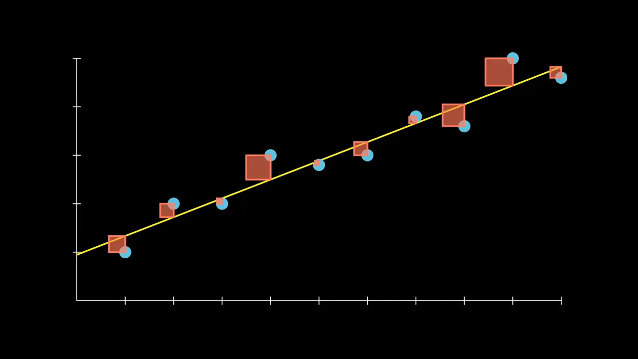 YouTube3:54
Next in Mathematical modeling: Regression modeling → Least squares and residual diagnostics.
Least squares and residual diagnostics · View learning sequence YouTube3:07
Next in Mathematical modeling: Regression modeling → Least squares and residual diagnostics.
Least squares and residual diagnostics · View learning sequence YouTube8:04
Next in Mathematical modeling: Regression modeling → Least squares and residual diagnostics.
Least squares and residual diagnostics · View learning sequenceYouTube6:05Explanation of Regression modeling, complementing the current application.
Regression modelingWhiteboard for Outlier handling, compared with the current lecture.
Outlier handling YouTube4:28
Explanation of Linear programming model, complementing the current proof.
Linear programming modelVisual explanation for Outlier handling, compared with the current lecture.
Outlier handling YouTube5:59
Explanation of Linear programming model, complementing the current proof.
Linear programming model