What the SIR model describes
The video introduces SIR as a simple mathematical model for the spread of disease through a population over time. It is presented first through a graph and then through compartment definitions.
Brian Sullivan · YouTube · 10:09
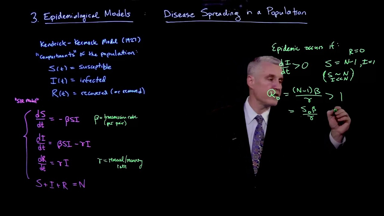
This 150-second clip is an introductory lecture on the basic SIR model for disease spread. It first shows a graph of susceptible, infected, and recovered fractions over time and explains that "flatten the curve" refers to lowering the peak of the infected curve. It then attributes the simplest SIR model to Kermack and McKendrick (1927), defines the three population compartments S, I, and R as fractions of the population, and lists the core assumptions used in the basic model: no births, no immigration, total immunity after recovery, fixed infection rate per day, fixed recovery time, and well-mixed people. This introductory segment explains the susceptible equation in an SIR model through a paint-bucket metaphor and a contact example. It defines S, I, and R as compartments, shows that loss from S is written as dS/dt = -βSI, identifies β as contacts per infected person per day, and uses smiley-face animations to demonstrate why the rate depends on the number of susceptible individuals rather than on contacts alone. This educational video introduces the SIR (Susceptible-Infected-Recovered) compartmental model for epidemiological dynamics. Using a visual analogy of fluid flowing between three connected buckets, the narrator derives the system of ordinary differential equations that governs the spread of a disease. The segment explains how the rate of new infections depends on the product of susceptible and infected populations (mass action kinetics), and how recovery removes individuals from the infected pool. Key parameters like the transmission rate (β) and recovery rate (γ) are defined in terms of daily contacts and illness duration. This 150-second introductory lecture segment explains a simple SIR model for disease spread. The screen shows the system dS/dt = -βSI, dI/dt = βSI - γI, dR/dt = γI, together with annotations defining β as contacts per infected per day and γ as recoveries per person per day. The speaker interprets as days to recover, combines this with β to obtain as contacts per infection, and identifies that ratio with . The clip then states the threshold rule: if the infection spreads, while if it eventually decreases and dies out. In the final portion, a graph of fraction of population versus days appears, and the speaker uses the signs of the equations to explain why S always decreases, R always increases, and I rises to a peak before decaying. This introductory segment presents the core mathematical framework of the SIR epidemiological model. It displays the system of ordinary differential equations governing the Susceptible, Infected, and Recovered population compartments, alongside the definition of the basic reproduction number . An animated graph illustrates the temporal dynamics of these populations over a 100-day period, showing the characteristic rise and fall of infections and the depletion of susceptibles. The narrator notes that solving these differential equations requires specific mathematical techniques, which will be covered in future videos.
Use the learning inspector for key ideas and moments, or open the reading tabs for the complete notes.
Generated from the video's visuals and explanation; not verbatim speech.
The clip opens by naming its subject: an introduction to SIR models for the spread of disease. The title slide keeps the focus on the acronym SIR and the application to epidemics.
It then shifts to a time-series graph whose horizontal axis is Days and vertical axis is Fraction of Population. Three curves are shown: a red Susceptible curve that decreases, a blue Recovered curve that increases, and a green Infected curve that rises to a peak and then falls.
The speaker uses this graph to explain the phrase "flatten the curve." The quantity of interest is the infected fraction, so the goal described here is to make the peak of the green curve smaller rather than to change the axes themselves.
After the intuitive graph, the video gives historical context. It identifies the simplest SIR model as the Kermack–McKendrick model from 1927 and shows the paper title "A Contribution to the Mathematical Theory of Epidemics."
The model is then built from compartments. A red cylinder labeled S is introduced as the susceptible fraction, a green cylinder labeled I as the infected fraction, and a light blue cylinder labeled R as the recovered fraction. The wording emphasizes fractions of the population, not absolute counts.
With the compartments in place, the lecture lists the assumptions that define this basic version of the model. First, there are no births and no immigration, so the total population is closed and fixed.
Next, recovery is assumed to give total immunity. The speaker notes that this is a simplification because real immunity can depend on mutation and other factors, but in this model recovered individuals do not return to the susceptible class.
The remaining assumptions concern rates and mixing. The model assumes a fixed infection rate per day, a fixed recovery time, and that people are well mixed, meaning behavior and contact patterns are treated as uniform across the affected region.
By the end of the clip, the viewer has seen the qualitative epidemic graph, the historical attribution, the three compartments S, I, and R, and the core assumptions that will underlie the basic SIR formulation.
The clip opens with three labeled cylinders—S, I, and R—and uses them as a physical metaphor for the SIR compartments. S is the red source bin, I is the middle bin that receives material, and R is the lower-right bin standing for the recovered/removed group.
A string connects S to I. As liquid enters I, I becomes heavier and pulls the string, tipping S farther so that it empties faster. This visualizes a coupling in which the rate at which S decreases depends on the current amount in I.
The narration adds a second dependence: S can only empty if there is still material left in S. Thus the outflow from S depends jointly on the present level of I and the remaining level of S.
That joint dependence is then written symbolically as . The left-hand side is explained as the instantaneous rate of change of the susceptible population with respect to time.
The minus sign is interpreted directly: susceptibles are being depleted as they become infected, so is negative whenever the product is positive.
The parameter is identified on screen with units “contacts per infected per day.” In words, each infected individual contributes contacts per day in this simplified model.
To make the contact idea concrete, the video switches to smiley faces: one green infected individual is shown below a row of red susceptible individuals. The example assigns three contacts per day to the infected person.
When all contacted individuals are susceptible, three red faces turn green, illustrating three new infections from three contacts.
The next step introduces immune individuals as blue faces in the contacted pool. Now the same number of contacts can land on immune people, and those contacts do not create new infections.
By comparing the all-susceptible case with the mixed susceptible/immune case, the clip shows why the size of the susceptible population matters: transmission success is not determined by contacts alone, but by contacts with susceptible people.
The equation returns on screen as the summary of the example. The closing point is that the depletion rate of susceptibles is proportional to the number currently in , together with the infected population and the contact-rate parameter.
The video begins by illustrating the core mechanism of disease transmission: the rate at which susceptible individuals become infected is directly proportional to the number of currently infected people. An animation shows that increasing the number of infected agents accelerates the conversion of susceptible agents, demonstrating a non-linear spread dynamic.
Transitioning to a continuous mathematical model, the narrator uses a visual analogy of three stacked buckets representing the Susceptible (S), Infected (I), and Recovered (R) populations. The first differential equation, dS/dt = -βSI, is derived. The negative sign indicates depletion, and the product SI captures the requirement that both groups must interact for transmission to occur, scaled by the contact rate β.
Next, the focus shifts to the Infected bucket. Its rate of change is determined by two competing flows: it gains individuals at the exact rate the Susceptible bucket loses them (βSI), but it also loses individuals as they recover. A drainage pipe is added to the visual, introducing the recovery term -γI. This yields the equation dI/dt = βSI - γI.
The parameter γ is explicitly defined as the inverse of the average infectious period. For instance, if recovery takes 20 days, per day. This establishes the biological meaning behind the mathematical coefficient.
Finally, the Recovered bucket is analyzed. Since it only receives inflow from the Infected bucket's drainage, its rate of increase perfectly mirrors the loss rate of the infected population. This results in the third equation, dR/dt = γI. The segment concludes by displaying the full system of ODEs and summarizing the physical interpretations of β and γ.
The segment opens on the SIR system written as , , and . The speaker first interprets through a concrete example: if recovery takes 20 days, then each day one recovers one twentieth of the way, so per day.
From that unit interpretation, the reciprocal is identified as the number of days required to recover. This is the bridge from a daily rate to a duration.
Next, assuming an infectious person continues making contacts, the total contacts during one infectious period equal daily contacts times infectious duration. Symbolically this is , which the video labels as contacts per infection.
The ratio is then named . The speaker presents the threshold rule in words: if , the infection spreads through the population; if , it may spread somewhat at first but will not sustain exponential growth and will eventually decrease and die out.
The lecture then shifts from definition to intervention. Because , the speaker distinguishes the numerator from the denominator: recovery time is hard to change behaviorally, but daily contacts can be reduced. This is the basis for the emphasis on social distancing.
A practical behavioral conclusion follows: act as if already infected, because that assumption leads to choices that reduce transmission most effectively.
At this point a graph appears showing fraction of population versus days for Susceptible, Infected, and Recovered. The speaker uses the equations to explain the curve shapes rather than solving them explicitly.
Since and with , the susceptible curve is always decreasing. Since with and , the recovered curve is always increasing.
The infected equation contains both a positive inflow and a negative outflow, so the green curve can rise, reach a peak, and then decay. The closing line indicates that the qualitative story told by the equations matches the displayed graph.
The video opens by displaying the fundamental system of ordinary differential equations for the SIR model: dS/dt = -βSI, dI/dt = βSI - γI, and dR/dt = γI. Below these equations, the basic reproduction number is defined as . To the right, an animated graph plots the fraction of the population in each compartment over 100 days. The red curve representing the susceptible population starts at 1.0 and steadily declines. The green curve for the infected population rises rapidly, peaks around day 20, and then gradually falls back to zero. The blue curve for the recovered population starts at zero and continuously increases, eventually approaching 1.0 as the epidemic concludes. The narrator explains that while this visualizes the outcome of solving the equations, the actual process of solving them involves specific mathematical tricks typical of differential equations, which will be detailed in subsequent lessons.
The video introduces SIR as a simple mathematical model for the spread of disease through a population over time. It is presented first through a graph and then through compartment definitions.
In the displayed graph, the red curve is the susceptible fraction and falls over time, the blue curve is the recovered fraction and rises over time, and the green curve is the infected fraction, which increases to a peak and then decreases.
The phrase is explained as reducing the peak of the infected curve. The visual emphasis is on the green Infected curve and its maximum height over time.
The clip attributes the simplest SIR model to Kermack and McKendrick in Scotland in 1927 and shows the paper title "A Contribution to the Mathematical Theory of Epidemics."
S is the fraction of the population that is susceptible, I is the fraction that is infected, and R is the fraction that is recovered. The video represents these as stacked colored cylinders.
The basic model assumes no births and no immigration, so the population size stays fixed and no new susceptibles are added from outside.
The model assumes recovery gives total immunity, meaning recovered individuals are no longer susceptible. The speaker notes this is a simplifying assumption rather than a universal biological truth.
The clip assumes a fixed infection rate per day, a fixed recovery time, and that people are well mixed so contact behavior and recovery timing can be treated as uniform across the affected region.
The introduction represents the population with three compartments: S for susceptibles, I for infectives, and R for recovered/removed individuals. The bucket picture treats S as a source that transfers into I through contact-driven loss.
The notation is defined as the rate of change of the susceptible population with respect to time, i.e. the change in S over the change in time.
In , the negative sign means the susceptible compartment is being depleted as people become infected. When , decreases.
The parameter is introduced as the contact rate of an infected person. The on-screen unit statement is “contacts per infected per day,” so measures daily contacts contributed by each infected individual.
The bucket metaphor shows two dependencies at once: more material in I pulls harder on S, and S can only lose what remains in S. Symbolically this becomes a product term multiplied by .
The smiley-face example shows that an infected person may make three contacts per day, but only contacts with susceptible individuals create new infections. If some contacted people are immune, the number of successful transmissions falls.
Blue faces represent individuals who are already immune or removed from the susceptible pool. Their presence explains why the depletion of S depends on the susceptible population size rather than on total population size alone.
A foundational epidemiological model that partitions a population into three compartments: Susceptible (S), Infected (I), and Recovered (R). It uses continuous flows to track how individuals transition between these states over time.
Describes the rate of change of the susceptible population. It decreases due to interactions with infected individuals, modeled by mass action kinetics.
Describes the net rate of change of the infected population. It increases via new infections (βSI) and decreases via recoveries (γI).
Describes the rate at which the recovered population grows, which is exactly equal to the rate at which infected individuals recover.
A positive constant representing the average number of adequate contacts per infected person per unit time that result in transmission.
A positive constant representing the fraction of infected individuals who recover per unit time. It is the reciprocal of the average duration of infectiousness.
The video displays a three-equation SIR system for disease spread: susceptibles decrease through infection, infecteds gain new cases from contacts and lose cases through recovery, and recovereds increase by the recovery flow.
β is annotated as contacts per infected per day, and γ is annotated as recoveries per person per day. These are the two rate parameters controlling infection and removal in the displayed model.
Using the spoken 20-day example, the clip interprets the reciprocal of the recovery rate as the recovery duration. If recovery takes 20 days, then per day and days.
Explore conditions, steps and evidence. Supplementary explanations are labeled separately from content shown in the video.
The speaker names the topic as "SIR models for the spread of disease".
Title slide reads "SIR Models" and subtitle reads "For the spread of Disease".
SIR
Name of the compartmental epidemic model discussed in the video.
Applied mathematics / epidemiology
A red cylinder labeled "S" appears on screen.
The speaker says "the susceptible" and then "So S, this bucket represents people who are at risk of getting the illness."
Text beside the red cylinder reads "The fraction of the population that is Susceptible".
S
Fraction of the population that is susceptible to the illness.
Population fraction in the SIR model
A green cylinder labeled "I" appears below the red one.
The speaker says "the infected" and then "I is the fraction of people that are infected".
Text beside the green cylinder reads "The fraction of the population that is Infected."
I
Fraction of the population that is infected.
Population fraction in the SIR model
A light blue cylinder labeled "R" appears below the green one.
The speaker says "and the recovered" and then "R is the fraction of the population that's recovered".
Text beside the blue cylinder reads "The fraction of the population that is Recovered."
R
Fraction of the population that has recovered.
Population fraction in the SIR model
Slide title reads "The Kermack–McKendrick Model (1927)".
The speaker says the first SIR model was developed by Kermack and McKendrick in Scotland in 1927.
Kermack–McKendrick Model
Historical name given in the video to the simplest SIR model introduced here.
History of mathematical epidemiology
A red cylinder labeled S is shown at the upper left; later it is tilted and pours red liquid into the I bin.
In dS/dt = -βSI, the letter S is colored red.
The speaker refers to “the S bin,” “susceptible people,” and “how many people are available to become infected.”
S
Susceptible population, represented visually as a red bin and in the equation as the number of susceptible individuals.
Nonnegative count of susceptible individuals in the modeled population.
A gray cylinder labeled I sits below S; green liquid accumulates in it during the pouring animation.
In dS/dt = -βSI, the letter I is colored green.
The speaker says “the I bin gets some paint spilled into it” and “how many people are already infected.”
I
Infected population, represented visually as the middle bin and in the equation as the number of currently infected individuals.
Nonnegative count of infected individuals in the modeled population.
A third gray cylinder labeled R is visible at the lower right throughout the bucket-model portion.
Later the speaker discusses people who are “already immune” and a “protected population,” matching the R compartment concept.
The clip does not display an explicit equation for dR/dt or define R with a formula on screen.
R
Recovered or removed/immune compartment, shown as the lower-right bin in the SIR diagram.
Nonnegative count of recovered/removed individuals in the modeled population.
The displayed derivative is written as dS/dt.
The speaker says “The rate of change of S versus time” and explains it as “the change in S over the change in time.”
t
Time variable with respect to which the susceptible population changes.
Continuous time variable in the differential-equation model.
The equation shown is dS/dt = -βSI.
A caption appears reading “[β] = contacts per infected per day”.
The speaker asks, “What are the units of this beta constant?” and answers that it is “the number of contacts per infected person per day.”
β
Transmission/contact-rate constant multiplying the product SI in the infection term.
Positive parameter with units contacts per infected person per day.
The left-hand side of the displayed equation is dS/dt.
The speaker explicitly identifies it as “the rate of change of S versus time” and “the change in S over the change in time.”
dS/dt
Instantaneous rate of change of the susceptible population with respect to time.
Real-valued derivative quantity; in this model it is negative when βSI > 0.
The symbol S appears in the differential equation dS/dt = -βSI.
The speaker refers to the 'susceptible population' and the 'red bucket'.
S
Susceptible population size (represented by the red bucket)
Non-negative real numbers
The speaker introduces the video as an introduction to SIR models for the spread of disease.
Opening slide reads "SIR Models" with subtitle "For the spread of Disease".
The video presents the SIR model as a mathematical framework for describing how a disease spreads through a population over time. The speaker frames it as the simplest model in this family and uses it to explain the curves often shown in discussions of epidemics.
The model is being used to describe disease spread in a population.
The speaker says the model assumes the population can be divided into three parts: susceptible, infected, and recovered.
Three stacked cylinders appear, labeled S, I, and R in red, green, and light blue respectively.
Each cylinder is paired with text defining it as a fraction of the population.
The SIR model divides the whole population into three mutually described groups represented as buckets or cylinders: S for susceptible individuals, I for infected individuals, and R for recovered individuals. In this clip these are explicitly described as fractions of the population rather than raw counts.
The population is partitioned into susceptible, infected, and recovered groups.
S, I, and R are treated as fractions of the total population.
The speaker lists assumptions one by one: no births, no immigration, recovery gives total immunity, fixed infection rate per day, fixed recovery time, and people are well mixed.
A bullet list titled "Assumptions:" appears and grows item by item.
The video states that the basic SIR model assumes a closed population with no births and no immigration, permanent immunity after recovery, a fixed infection rate per day, a fixed recovery time, and uniform mixing of people across the affected region. These assumptions define the simplified setting in which the model is introduced.
No births occur.
No immigration occurs.
Recovery confers total immunity.
There is a fixed infection rate per day.
There is a fixed recovery time.
People are well mixed.
Three cylinders labeled S, I, and R are arranged diagonally; S is red, I and R are gray.
From about 14 s onward, a string connects S to I, S tilts, and red liquid pours into I while green liquid accumulates in I.
The speaker introduces this as “one way that you can imagine these bins being related” and describes the S bin as mounted above and tied to the I bin.
The video defines the three compartments by analogy: S is a red bin representing susceptibles, I is the middle bin receiving spilled material and representing infectives, and R is the lower-right bin representing the recovered/removed group. The metaphor emphasizes that S feeds into I through contact-driven transfer.
Used as an introductory visual model for disease spread.
The clip explicitly develops only the S-to-I transfer relation in this segment.
The equation displayed is dS/dt = -βSI.
The speaker says the change in S “is going to be a decrease” because “we’re getting fewer susceptible people as they become infected.”
The minus sign encodes depletion of the susceptible compartment: as infections occur, people leave S, so the time derivative of S is negative whenever the infection term βSI is positive.
Applies to the susceptible compartment in the basic mass-action SIR formulation shown here.
Assumes S and I are nonnegative counts and β is positive.
On-screen text reads “[β] = contacts per infected per day”.
The speaker states that β is “the number of contacts per infected person per day.”
β is introduced as the contact-rate parameter. Its displayed unit is contacts per infected person per day, meaning each infected individual contributes β contacts per day in the simplified model.
Used in the equation dS/dt = -βSI.
The clip presents this as the model’s interpretation of β rather than deriving it from a more detailed contact process.
The speaker introduces the concept of tracking susceptible, infected, and recovered populations using buckets.
The video displays three connected buckets labeled S, I, and R, with fluid transferring between them.
The SIR model is a mathematical framework used to understand the spread of infectious diseases within a population. It divides the population into three compartments: Susceptible (S), Infected (I), and Recovered (R). The model tracks how individuals move between these compartments over time.
Population is closed (no births, deaths, or migration).
Individuals are homogeneous in their susceptibility and infectivity.
Transitions between compartments are continuous and differentiable.
The equation dS/dt = -βSI is displayed on screen.
The speaker explains that the rate at which we lose susceptible individuals is proportional to the infected people.
This differential equation describes how the number of susceptible individuals decreases over time. The rate of decrease is proportional to both the current number of susceptible individuals (S) and the current number of infected individuals (I), scaled by the transmission rate (β).
,
The equation dI/dt = βSI - γI is displayed on screen.
The speaker explains that the infected bucket gains from the susceptible bucket's loss and loses due to recovery.
This differential equation describes how the number of infected individuals changes over time. It increases due to new infections (proportional to βSI) and decreases due to recoveries (proportional to γI).
,
,
The equation dR/dt = γI is displayed on screen.
The speaker states that any gain in the recovered bucket is from the middle bucket's loss.
This differential equation describes how the number of recovered individuals increases over time. The rate of increase is equal to the rate at which infected individuals recover, which is proportional to the number of infected individuals (I) scaled by the recovery rate (γ).
The screen displays the three-equation system dS/dt = -βSI, dI/dt = βSI - γI, dR/dt = γI.
Throughout the clip the speaker interprets these equations verbally, including their signs and graph behavior.
The video presents a three-compartment SIR model for disease spread. Susceptibles decrease through infection, infecteds gain new cases from susceptible-infected contacts and lose cases through recovery, and recovereds increase by the recovery flow out of the infected class.
The displayed equations are the model being discussed.
The video does not explicitly state normalization assumptions such as or .
The annotation [β] = contacts per infected per day is visible beside the equations.
At 02:06.400 the speaker states that beta is a positive constant.
In this clip β is defined operationally as the number of contacts made per infected person per day. It multiplies the interaction term SI in the infection flow.
β is treated as a positive constant in the spoken explanation.
The speaker says the first SIR model was developed by Kermack and McKendrick in Scotland in 1927.
Slide reads "The Kermack–McKendrick Model (1927)" and "A Contribution to the Mathematical Theory of Epidemics".
The video identifies the simplest SIR model as the one developed by Kermack and McKendrick in 1927 under the paper title "A Contribution to the Mathematical Theory of Epidemics".
The discussion is about the historical origin of the basic SIR model.
Existential attribution to named authors and a specific year.
The speaker says that when people hear about "flatten the curve," the curve being discussed is the number of people who are infected at any given time, represented by the green curve with a peak.
A graph shows a green infected curve with a peak, alongside red susceptible and blue recovered curves.
In this clip, "flatten the curve" is explained as reducing the peak of the infected fraction over time, i.e. making the green infected curve lower.
The graph is interpreted as showing susceptible, infected, and recovered fractions over time.
Descriptive claim about the meaning of a phrase in the displayed graph.
The displayed governing equation is dS/dt = -βSI.
The speaker says the rate depends “both on how many people are available to become infected and how many people are already infected,” and later concludes that the depletion rate “is proportional to the number of people who are already in the susceptible population.”
The smiley-face sequence shows that when some contacts land on immune individuals, fewer new infections occur.
The spoken conclusion emphasizes proportionality to S; the full displayed formula also includes I and β.
In the model shown, the rate at which susceptibles are lost satisfies dS/dt = -βSI, so the magnitude of depletion is proportional to both the susceptible population S and the infected population I, with proportionality constant β.
The population is divided into S, I, and R compartments.
Contacts occur at rate β per infected person per day.
A contact leads to infection only if the contacted person is susceptible.
For the compartment model displayed in this clip, at each time t the instantaneous rate obeys the stated relation.
The speaker asks why the size of the susceptible population matters and then posits that some individuals are “already immune.”
Blue faces appear among the row of contacts, and arrows show that contacts landing on blue faces do not produce new green infections.
If some contacted individuals are already immune, then the same number of contacts produces fewer newly infected people, which is why the infection term depends on the susceptible fraction/count S rather than on total population alone.
Some individuals in the contact pool are immune/removed.
Contacts are distributed across susceptible and immune individuals.
Illustrated for a fixed number of daily contacts in the example sequence.
The speaker states, 'the rate at which we lose susceptible individuals is proportional to the infected people.'
The animation shows that increasing the number of infected faces leads to more susceptible faces turning green.
The rate at which susceptible individuals become infected is directly proportional to the product of the number of susceptible individuals and the number of infected individuals.
The population is well-mixed.
Each individual has an equal probability of contacting any other individual.
For all susceptible and infected individuals in a closed population.
The speaker notes that 'this bucket's loss, the red bucket's loss is the green bucket's gain' and 'any gain in this bucket is from the middle bucket's loss'.
The sum of the right-hand sides of the three differential equations is zero: (-βSI) + (βSI - γI) + (γI) = 0.
The total population size remains constant over time, as the rate of loss from one compartment exactly equals the rate of gain in another.
No births, deaths, or migration occur in the population.
For all time .
At 00:51.680 the speaker says, "If this number, the ratio of beta and gamma in our model, is greater than one, then the infection is going to spread through a population."
At 00:58.960 the speaker says, "And if it's less than one, then it won't. It'll spread some, but it won't have exponential growth. It'll decrease and die out over time."
The on-screen annotation identifies the ratio as .
The statement is given verbally without a formal proof in this clip.
In the video’s simplified SIR discussion, if then the infection spreads through the population; if then it does not sustain exponential growth and eventually decreases and dies out.
The model is the displayed SIR system.
β and γ are positive constants.
is identified with in this clip.
For the model parameters discussed in the segment.
At 02:00.560 the speaker says the rate of change of S is always negative.
At 02:06.400 the speaker justifies this by saying these numbers are never negative and beta is a positive constant.
The displayed equation is dS/dt = -βSI.
Under the displayed model with nonnegative compartments and positive β, dS/dt ≤ 0, so S is always decreasing.
, .
.
The equation dS/dt = -βSI holds.
For all times considered in the model under the stated sign assumptions.
At 02:15.120 the speaker says, "Similarly, R is always increasing."
The displayed equation is dR/dt = γI.
Under the displayed model with nonnegative I and positive γ, dR/dt ≥ 0, so R is always increasing.
.
.
The equation dR/dt = γI holds.
For all times considered in the model under the stated sign assumptions.
At 02:19.200 the speaker says the green population has two terms, one positive and one negative, giving growth followed by a peak and decay.
The graph shown from about 01:53 onward depicts the infected curve rising to a peak and then declining.
The clip gives a qualitative explanation rather than deriving the exact peak condition.
In the displayed SIR dynamics, the infected class can increase at first because of the positive term βSI, then later decrease because of the negative term -γI, producing a peak followed by decay.
The model is the displayed SIR system.
β,.
S,I,R are nonnegative.
Qualitative statement about the trajectory illustrated in the video.
The speaker verbally maps each colored curve to susceptible, recovered, and infected populations and identifies the infected peak as the quantity to flatten.
A plot with axes "Days" and "Fraction of Population" shows red, green, and blue curves labeled in a legend as Susceptible, Infected, and Recovered.
The graph is presented with horizontal axis "Days" and vertical axis "Fraction of Population".
Directly visible in the diagram.
The red curve is identified as the susceptible fraction and is described as falling over time.
The speaker explicitly says the susceptible people in a population over time is falling, and the legend labels the red curve as Susceptible.
The blue curve is identified as the recovered fraction and is described as going up over time.
The speaker explicitly says the number of people who recover goes up over time, and the legend labels the blue curve as Recovered.
The green curve is identified as the infected fraction and has a peak.
The speaker says the thing we want to flatten is the number of people who are infected at any given time, represented by the green curve, and notes a peak.
The phrase "flatten the curve" is linked to lowering the peak of the green infected curve.
The speaker directly connects "flatten the curve" to the infected curve and says the peak should be smaller.
The introductory graph is used to show that the infected fraction rises to a peak and then falls, and that epidemic control language such as "flatten the curve" refers to reducing that peak.
The S bin is tied to the I bin; as I gains liquid, S tips further and empties faster.
The speaker says the heavier the I bin is, the faster the S bin empties, but the emptying also depends on how much is already in S.
This verbal mechanism is then encoded as dS/dt = -βSI.
The setup establishes S as the source compartment and I as the recipient compartment.
Directly shown by the labeled bins and stated in the narration.
As I increases, the pull on the string increases, so the outflow from S speeds up.
Explicitly described by the speaker and illustrated by the tipping animation.
The outflow from S also depends on how much remains in S, because there must be material available to spill.
Stated verbally: the S bin’s emptying depends on how much paint is left to spill.
These two dependencies are combined into a product form with a negative sign for depletion.
The equation is displayed immediately after the metaphor explanation.
The physical metaphor motivates the mathematical form dS/dt = -βSI: loss from S grows with both current I and current S.
The speaker says an infected person has three contacts per day and those three random people become infected.
A green face is shown below a row of ten red faces; three red faces turn green.
Later, four blue faces are added to the row, and only two of the three contacted red faces become green while one contact lands on a blue face.
The exact positions of the contacted faces vary across frames; the stable mathematical point is that three contacts yield three infections when all targets are susceptible, but fewer when some targets are immune.
Start with one infected individual and a row of susceptible individuals.
Shown visually as one green face and ten red faces.
Assign the infected person three contacts per day.
Stated directly by the speaker as the example value for β in this scenario.
When all three contacted people are susceptible, all three become infected.
The first animation turns three red faces green.
When some people in the contact pool are immune, one of the three contacts lands on an immune person and does not create a new infection.
The second animation introduces blue faces and shows fewer successful transmissions.
The example demonstrates why the infection term scales with the susceptible population: the same contact rate produces fewer new cases when fewer contacted people are susceptible.
The speaker builds the system of equations step-by-step based on the physical flow of individuals between compartments.
The visual representation of buckets and flowing liquid directly maps to the mathematical terms added to each equation.
The susceptible population decreases only through infection. The rate of infection is modeled as proportional to the encounters between susceptibles and infecteds, hence the term βSI. The negative sign indicates a loss.
Mass action kinetics assumption for disease transmission.
The infected population increases by gaining those who were just infected (βSI) and decreases by losing those who recover. Recovery is modeled as a constant fraction γ of the infected population leaving per unit time.
Conservation of mass between compartments and exponential waiting time for recovery.
The recovered population increases solely by receiving those who have recovered from the infected compartment. The rate is exactly the same as the rate at which they leave the infected compartment.
Direct transfer from the infected compartment without further loss.
The complete system of ordinary differential equations describing the SIR model is derived.
At 00:00.000 the speaker gives the example that if recovery takes 20 days, one recovers a twentieth of the way each day.
At about 00:14 the annotation [] = days to recover appears.
Interpret γ as recoveries per person per day.
Displayed annotation [γ] = recoveries per person per day.
Use the spoken example: a 20-day recovery corresponds to recovering one twentieth per day.
Audio explanation at 00:00.000-00:09.760.
Take the reciprocal to recover the duration in days.
Audio at 00:10.160 plus on-screen annotation [] = days to recover.
The reciprocal represents the number of days to recover in the video’s interpretation.
At 00:18.880 the speaker says that contacts per day times days to recover gives the number of contacts while infectious.
At about 00:34 the annotation [] = contacts per infection appears.
Assume an infected person continues moving about and making contacts while infectious.
Audio at 00:18.880-00:29.760.
Multiply daily contacts β by infectious duration .
Spoken combination of the two previously introduced quantities.
Rewrite the product as a ratio.
Algebraic simplification; also shown on screen as [] = contacts per infection.
The total number of contacts during one infection is .
At 02:00.560-02:14.240 the speaker analyzes the sign of dS/dt.
At 02:15.120-02:18.480 the speaker analyzes R.
At 02:19.200-02:28.080 the speaker analyzes the infected class as having one positive and one negative term.
From about 01:53 onward, the graph shows S decreasing, R increasing, and I peaking then decaying.
The derivation is qualitative; the clip does not solve the system explicitly.
Start from the susceptible equation.
Displayed formula.
Since S and I are nonnegative and β is positive, the right-hand side is nonpositive.
Audio at 02:06.400-02:14.240.
Since I is nonnegative and γ is positive, the recovered class cannot decrease.
Audio at 02:15.120-02:18.480.
The infected equation contains a positive infection term and a negative recovery term.
Displayed formula and audio at 02:19.200-02:28.080.
The competition between the two terms allows I to rise first and then fall after the peak.
Audio explanation matched to the displayed graph.
The signs of the right-hand sides explain why S decreases monotonically, R increases monotonically, and I exhibits a peak followed by decay.
“So suppose I’m an infected person… the number of contacts per day for me is three.”
One green face below a row of red faces; three red faces are selected and turn green.
In the follow-up case, blue faces are present and one of the three contacts lands on a blue face instead of producing a new green face.
The clip does not state a formal probability calculation; it presents the example visually and verbally.
Show how an infected person with three daily contacts infects others when the contacted pool is entirely susceptible, and then what changes when some contacted individuals are immune.
One infected individual is represented by a green face.
The initial contacted pool contains susceptible individuals represented by red faces.
The infected person makes three contacts per day.
In the second scenario, some individuals in the pool are immune and are represented by blue faces.
Compare the number of newly infected individuals produced by the same contact rate in the two scenarios.
In the all-susceptible case, the infected person contacts three red individuals.
Stated by the speaker and shown by the selection of three faces.
All three contacted red individuals become infected, i.e., turn green.
Visible in the first animation.
In the mixed case, the same three contacts include at least one immune (blue) individual.
The speaker introduces immune people and the animation shows blue faces in the row.
Only the contacts landing on susceptible individuals produce new infections; the contact landing on an immune individual does not.
Shown by arrows from green faces to red/blue faces and by the unchanged blue face.
With three contacts per day, the all-susceptible example yields three new infections; once immune individuals are present, the same three contacts yield fewer new infections because some contacts hit immune people.
The visual comparison between the two animations directly confirms that adding immune individuals reduces the number of successful transmissions.
At 00:00.000 the speaker says, "if it took 20 days to recover, you could imagine that you were recovering a twentieth of the way each day of that time period."
The subsequent annotation [] = days to recover makes the numerical interpretation explicit.
If recovery takes 20 days, how should the recovery rate γ be interpreted?
Recovery duration = 20 days.
γ is described as recoveries per person per day.
Explain the daily interpretation of γ and the meaning of .
Recovering one twentieth of the way each day corresponds to a daily recovery rate of .
Directly stated in the audio at 00:00.000-00:09.760.
Taking the reciprocal returns the recovery duration in days.
Audio at 00:10.160-00:16.880 and on-screen annotation.
A 20-day recovery corresponds to per day, and days.
The reciprocal relation matches the displayed annotation [] = days to recover.
White title slide with large text "SIR Models" and smaller subtitle "For the spread of Disease".
The speaker introduces the video as an introduction to SIR models for disease spread.
Title text "SIR Models"
Subtitle text "For the spread of Disease"
The slide remains static while the speaker introduces the topic.
The topic name SIR and the disease-spread framing stay on screen.
This visual establishes the subject of the clip before any graph or model components are shown.
A graph appears with x-axis "Days", y-axis "Fraction of Population", and legend entries Susceptible, Infected, Recovered.
A cursor moves among the curves and a light blue arc is drawn over the peak of the green infected curve.
The speaker explains what each curve represents and identifies the infected peak as the curve to flatten.
Red susceptible curve
Green infected curve
Blue recovered curve
Axes labeled Days and Fraction of Population
Legend
Light blue hand-drawn arc over the infected peak
The graph replaces the title slide.
The cursor points to different curves in sequence.
A light blue arc is drawn over the peak of the green infected curve.
The three colored curves remain visible throughout the segment.
The axes and legend remain fixed.
The visual demonstrates the qualitative behavior of the SIR variables over time and highlights that the infected curve has a peak that the speaker wants to reduce.
A white slide reads "The Kermack–McKendrick Model (1927)" and "A Contribution to the Mathematical Theory of Epidemics".
The speaker names Kermack and McKendrick, Scotland, 1927, and the paper title.
Title text "The Kermack–McKendrick Model (1927)"
Subtitle text "A Contribution to the Mathematical Theory of Epidemics"
The graph is replaced by a text-only historical slide.
The slide stays static during the attribution.
This segment situates the model historically before the video moves to the compartment diagram.
A red cylinder labeled S appears first, then a green cylinder labeled I, then a light blue cylinder labeled R.
Text appears beside each cylinder defining it as the fraction of the population that is Susceptible, Infected, or Recovered.
The speaker explains that the population is divided into three parts and defines each letter.
Red cylinder labeled S
Green cylinder labeled I
Light blue cylinder labeled R
Explanatory text lines
The red S cylinder appears first.
The green I cylinder appears below it.
The light blue R cylinder appears below the green one.
Definition text appears next to each cylinder as it is introduced.
The three cylinders remain stacked vertically once all are present.
The animation builds the core state space of the model by introducing the three population fractions one at a time.
A heading "Assumptions:" appears and bullet points are added sequentially.
The speaker reads and elaborates each assumption in order.
Heading "Assumptions:"
Bullet "No births"
Bullet "No immigration"
Bullet "Recovery gives total immunity"
Bullet "There's a fixed infection rate per day"
Bullet "There's a fixed recovery time"
Bullet "People are well mixed."
The assumptions heading appears.
Each bullet is added one after another while the speaker explains it.
The S, I, R cylinders remain visible beside the growing list.
The visual pairs the compartment diagram with the simplifying assumptions that make the basic SIR model tractable.
At first the three bins are separate; around 14 s a string appears between S and I.
Around 18 s the S bin tilts and red liquid pours into I while green liquid accumulates in I.
The R bin remains visible but unused in this segment.
Red bin labeled S
Gray bin labeled I
Gray bin labeled R
String connecting S to I
Red liquid stream
Green liquid in I
S changes from upright to tilted.
Red liquid flows from S into I.
Green liquid level in I rises.
The tilt of S increases as I fills.
The labels S, I, and R remain attached to their respective bins.
R is not shown receiving material in this clip.
The animation encodes a feedback-like dependency: more content in I corresponds to faster emptying of S, matching the product dependence on I in the equation.
The equation dS/dt = -βSI appears in the upper right while the bucket scene remains on screen.
A lower caption appears reading “[β] = contacts per infected per day”.
Bucket diagram
Equation dS/dt = -βSI
Unit caption for β
The mathematical notation is overlaid onto the physical metaphor.
The color coding links red S and green I in the formula to the corresponding bins.
The underlying bucket arrangement stays visible while the formula is discussed.
The overlay translates the verbal and visual mechanism into symbolic form and identifies β’s units.
A row of ten red smiley faces appears with one green sad face below.
Three red faces turn green in the first example.
Four blue faces are then added to the row, creating a mixed susceptible/immune pool.
Arrows show contacts from green faces to other faces; contacts to blue faces do not create new green faces.
The exact frame-by-frame order of which specific faces are chosen is not mathematically important and may vary slightly due to animation timing.
Red susceptible faces
Green infected faces
Blue immune faces
Contact arrows
Red faces convert to green when contacted and susceptible.
Blue faces remain unchanged when contacted.
The composition of the contacted pool changes from all-red to mixed red/blue.
Color consistently encodes compartment membership: red = susceptible, green = infected, blue = immune/removed.
This visual sequence demonstrates that transmission success depends on encountering susceptible individuals, not merely on making contacts.
The equation dS/dt = -βSI reappears at the lower left while the smiley-face row remains above.
The speaker concludes that the depletion rate is proportional to the number already in the susceptible population.
Smiley-face row
Equation dS/dt = -βSI
The discussion shifts from the concrete example back to the symbolic law.
The same equation is used to summarize the example’s lesson.
The final overlay ties the contact example back to the mathematical statement that loss from S depends on S.
Red smiley faces represent susceptibles, green frowning faces represent infecteds. As more green faces appear, red faces rapidly turn green.
Red smiley faces (Susceptibles)
Green frowning faces (Infecteds)
Number of green faces increases.
Number of red faces decreases.
Total number of faces remains constant at 10.
Visually demonstrates the non-linear acceleration of infection spread when the number of infected individuals increases, supporting the βSI interaction term.
Red liquid pours from the top 'S' bucket into the middle 'I' bucket. Green liquid drains from the 'I' bucket into the bottom 'R' bucket.
Top bucket labeled 'S' (Red liquid)
Middle bucket labeled 'I' (Green liquid)
Bottom bucket labeled 'R' (Blue/Green liquid)
Pipes connecting the buckets
Liquid level in S decreases.
Liquid level in I increases then decreases.
Liquid level in R increases.
Total volume of liquid across all three buckets remains constant.
Provides a continuous, macroscopic analogy for the differential equations, where flow rates correspond to derivatives and liquid levels correspond to state variables.
From the start until about 01:53, the screen shows only the SIR equations and parameter annotations on a white background.
New annotations appear sequentially: [] = days to recover around 00:14, [] = contacts per infection around 00:34, and [] = around 00:47.
Three SIR differential equations.
Annotations for β, γ, , , and .
Additional explanatory annotations are added one by one beneath or beside the equations.
The core three equations remain visible throughout this interval.
The visual progression builds the interpretation of the model parameters before introducing the graph.
The speaker says recovery gives total immunity, then adds that this depends on how much a virus mutates and some other factors, but the model assumes it for simplicity.
One might think the SIR model claims recovered people always have lifelong immunity in reality.
The video explicitly treats total immunity after recovery as a simplifying assumption and notes that real outcomes can depend on mutation and other factors.
The speaker calls well-mixed a more esoteric assumption and explains it as people behaving similarly throughout the affected region so contacts per day and recovery time can be characterized uniformly.
One might interpret "people are well mixed" as only a vague statement about interaction.
Here the video explains it as uniform behavior across the affected region, allowing daily contact counts and recovery time to be treated as the same throughout.
The speaker asks, “Why does it matter how many people are in the red population, the susceptible population?”
The animation shows that when a contact lands on a blue immune face, no new infection occurs.
One might think the infection rate depends only on how many contacts an infected person makes.
The video shows that contacts only create new infections when they reach susceptible individuals; immune individuals absorb contacts without becoming infected, so the susceptible population size matters.
The equation is written with a leading minus sign: dS/dt = -βSI.
The speaker explicitly says this represents “a decrease” in susceptible people.
A learner may read the equation as saying S increases because βSI is positive.
The minus sign indicates depletion: as infections occur, susceptibles leave the S compartment, so dS/dt is negative when βSI > 0.
The speaker contrasts a scenario where 'they each contacted three different people' resulting in 'nine of our original ten infected', highlighting the rapid spread.
People might assume that if one infected person infects a fixed number of others, the disease spreads linearly over time.
Because the number of infected individuals grows, the total number of new infections per time step also grows, leading to exponential-like initial spread until susceptibles are depleted.
At 01:17.640 the speaker says there is a difference between the numerator and the denominator.
At 01:20.840 the speaker says people cannot do much to change recovery time but can change contacts per day.
One might think reducing can be done equally through any parameter in .
The video emphasizes that the denominator, tied to recovery time, is hard to change behaviorally, whereas the numerator, tied to daily contacts, can be reduced through social distancing.
At 01:41.880 the speaker says, "it's best to just assume that you're already infected, and that will lead to the behaviors that make the most sense."
One might wait to change behavior until knowing one is infected.
The speaker recommends acting as if already infected in order to choose behaviors that reduce transmission most effectively.
After introducing the SIR model, the speaker says it assumes the population can be divided into three parts.
The S, I, R cylinders are introduced as the model's components.
The general SIR model introduced at the start is concretized by dividing the population into the three compartments S, I, and R.
The speaker asks what the assumptions beyond this are and then lists them while the compartment diagram remains on screen.
The assumptions list appears next to the already-defined S, I, R cylinders.
The three-compartment description is made into a specific basic SIR model by adding the listed simplifying assumptions.
The early graph labels curves as Susceptible, Infected, and Recovered.
Later the same three categories are formalized as S, I, and R compartments.
The video does not explicitly state that the graph is produced by solving the later-defined equations; the connection is inferred from matching labels and narration.
The S, I, R compartments correspond to the three plotted fractions in the introductory graph, and the infected compartment is the one whose peak is discussed as the curve to flatten.
The bucket mechanism is shown first.
The equation dS/dt = -βSI is introduced immediately afterward.
The physical bucket metaphor is used to justify the symbolic rule for the rate of change of S.
The main equation contains β.
The unit caption “[β] = contacts per infected per day” appears while the equation is on screen.
Understanding β’s interpretation as a contact rate supports the claim that the depletion term is proportional to infected activity and susceptible availability.
The smiley-face example shows fewer infections when immune people are present.
The speaker uses this to explain why the susceptible population size matters.
The numerical contact example illustrates the proposition that immunity reduces effective transmission and therefore makes the S-dependence natural.
Red faces are susceptible and turn green upon infection; blue faces are immune and stay blue when contacted.
The speaker distinguishes the “red population, the susceptible population” from people who are “already immune.”
The clip contrasts susceptible individuals, who can be newly infected, with immune/removed individuals, who cannot.
The entire segment is dedicated to translating a physical compartment model into mathematical rates of change.
The conceptual framework of the SIR model is mathematically formalized using systems of ordinary differential equations.
The term βSI appears in both dS/dt and dI/dt with opposite signs.
The rate of change of the infected population explicitly depends on the rate of new infections, which is the exact mechanism driving the decrease in the susceptible population.
The annotation first defines [] = contacts per infection and then adds [] = .
At 00:34.960-00:49.440 the speaker links the ratio to the name R naught or R zero.
In this clip, the quantity “contacts per infection” is identified directly with .
At 00:51.680-01:05.680 the speaker states the >1 and <1 outcomes for the ratio .
The on-screen label is attached to .
The threshold claim about whether the infection spreads is applied to the defined quantity .
At 01:54.960 the speaker says, "let's look at how they relate to the graph."
The graph appears while the equations remain on screen.
The qualitative graph is used to illustrate the consequences of the displayed differential equations.
Opening narration introduces SIR models for disease spread.
Title slide names the topic.
The speaker explains the red, blue, and green curves.
Graph with legend Susceptible, Infected, Recovered.
The speaker links "flatten the curve" to the infected curve peak.
A light blue arc is drawn over the infected peak.
The speaker names Kermack and McKendrick and the year 1927.
Historical slide shows the model name and paper title.
The speaker defines S, I, and R.
Three labeled cylinders appear with explanatory text.
The speaker lists the assumptions in order.
A bullet list titled Assumptions appears.
The equation dS/dt = -βSI is displayed.
The speaker says this is a decrease in susceptible people.
The on-screen text gives the units of β.
The speaker defines β as contacts per infected person per day.
The speaker asks why the size of the susceptible population matters.
The animation shows contacts landing on immune people do not create infections.
The S bin is tied to the I bin and tips further as I fills.
The speaker explains the metaphor verbally.
The speaker explicitly defines the units and meaning of beta.
The speaker gives an example: 'If the illness takes 20 days to recover, then gamma would be th.'
Covered · Title slide and spoken introduction establish the topic as SIR models for disease spread.
Covered · Graph of susceptible, infected, and recovered fractions is explained, including the meaning of flattening the infected curve.
Covered · Historical slide attributes the simplest SIR model to Kermack and McKendrick in 1927.
Covered · The three compartments S, I, and R are introduced visually and verbally as population fractions.
Covered · The model assumptions are listed and explained one by one while the compartment diagram remains on screen.
Covered · Introduction of the S, I, R bins and the bucket-and-string metaphor showing how S feeds I.
Covered · Display and explanation of dS/dt = -βSI, including the meaning of the negative sign and the units of β.
Covered · Smiley-face example showing three contacts per day and the effect of immune individuals on new infections.
Covered · Return to the equation and verbal conclusion that depletion of susceptibles is proportional to the susceptible population.
Covered · Introduction to the concept of infection spread using discrete agents.
Covered · Derivation of the first differential equation for the susceptible population.
Covered · Derivation of the second differential equation for the infected population, including the recovery term.
Covered · Derivation of the third differential equation for the recovered population and summary of parameters.
Covered · Introduces γ as recoveries per person per day and explains as days to recover using the 20-day example.
Covered · Explains that contacts per day times days to recover gives contacts per infection, yielding .
Covered · Names as and states the >1 versus <1 threshold behavior.
Covered · Discusses behavioral implications: reducing contacts per day is easier than changing recovery time, and recommends acting as if already infected.
Covered · Introduces the graph and relates the signs of the differential equations to the shapes of the S, I, and R curves.
Covered · The entire clip displays the SIR equations, the formula, and an animated graph of the population dynamics while the narrator introduces the topic.
Reviewed English material v2: card/concept_card "What the SIR model describes" starting at 0:00 — The video introduces SIR as a simple mathematical model for the spread of disease through a population over time. It is presented first through a graph and then through compartment definitions.
Reviewed explanation connection to Systems of ODEs.
Reviewed English material v2: card "Basic Reproduction Number " at 10:00 — The basic reproduction number is a key threshold parameter in epidemiology, defined as the ratio of the transmission rate to the recovery rate. It indicates the average number of secondary infections produced by a single infected individual in a fully susceptible population.
 YouTube9:20
Another explanation of Systems of ODEs.
Systems of ODEsAnother explanation of Compartmental differential equation models.
Compartmental differential equation modelsAnother explanation of Reproduction number.
Reproduction number YouTube6:25
Another explanation of Compartmental differential equation models.
Compartmental differential equation models YouTube4:45
Another explanation of Compartmental differential equation models.
Compartmental differential equation modelsYouTube6:25Whiteboard for Compartmental differential equation models, compared with the current lecture.
Compartmental differential equation modelsYouTube4:45Visual explanation for Compartmental differential equation models, compared with the current lecture.
Compartmental differential equation models YouTube3:33
Visual explanation for Compartmental differential equation models, compared with the current lecture.
Compartmental differential equation models